Download Optometrists Data (Shapefile, KML, CSV) – Global Eye Care GIS Database

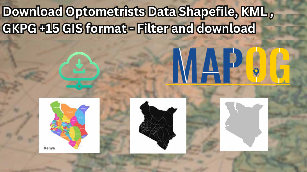
Finding accurate Optometrists Data is now easier than ever. GIS Data by MAPOG is a user-friendly platform that allows you to access, analyze, and download optometrists’ geographic data in various formats like Shapefile, KML, MID, and 15+ GIS formats. This data is valuable for researchers, healthcare organizations, policymakers, and GIS professionals looking to map optometry clinics, eye care centers, and vision specialists worldwide.

Why Use GIS Data for Optometrists?

With an intuitive interface, MAPOG ensures you can download Optometrists Data efficiently for over 200 countries and 900+ layers. Whether for healthcare planning, spatial analysis, or business expansion, this platform provides a comprehensive database with flexible export options.

Download Optometrists Data of any countries

Note:
  • All data is provided in GCS datum EPSG:4326 WGS84 CRS (Coordinate Reference System).
  • Users need to log in to access and download their preferred data formats.

Step-by-Step Guide to Download Optometrists Data

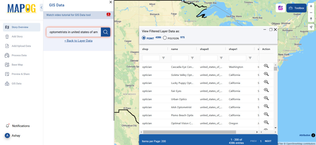
Step 1: Search for Optometrists Data

Log into MAPOG GIS Data and select the desired country. Use the search bar to locate Optometrists Data layers. View essential details such as location type (point or polygon) before proceeding.

Download Optometrists Data
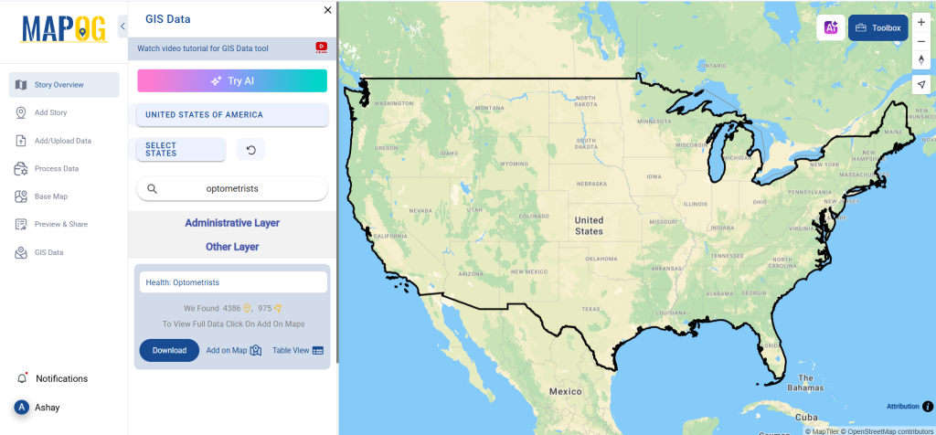
Step 2: Utilize the AI Search Tool

MAPOG’s Try AI feature helps users find data effortlessly. Enter ‘Optometrists Data’ along with a specific location, and the AI will retrieve relevant datasets quickly.

Download Optometrists Data
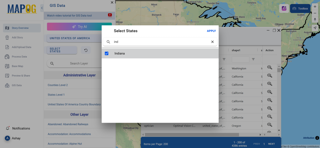
Step 3: Apply Data Filters

Refine your dataset using advanced filtering options. Narrow results by state, city, or district to get more precise optometrist location data. This ensures you download only the most relevant information.

Download Optometrists Data
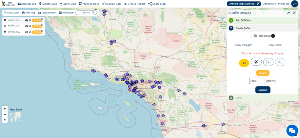
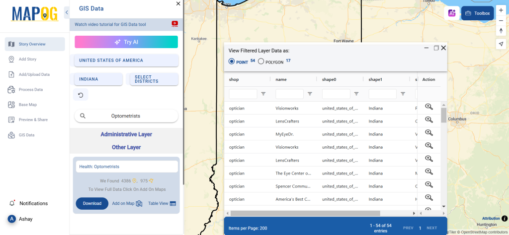
Step 4: Add Data to Map

Enhance your GIS project by adding optometrist data to the map. Click on ‘Add on Map’ to visualize optometry centers within the chosen area, aiding spatial analysis and decision-making.

Download Optometrists Data
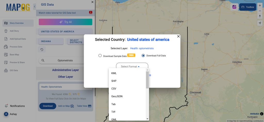
Step 5: Download Optometrists Data

Click ‘Download Data’ and choose between sample or full datasets. Pick from over 15+ GIS formats like Shapefile (SHP), KML, GeoJSON, MID, MIF, CSV, XLSX, and more. Agree to the terms and conditions before finalizing your download.

Download Optometrists Data

Conclusion

With GIS Data by MAPOG, accessing and downloading Optometrists Data is straightforward. Whether for healthcare analysis, urban planning, or business intelligence, having detailed optometry location data in multiple GIS formats enhances decision-making. Start your search today and unlock valuable insights into optometry services worldwide!

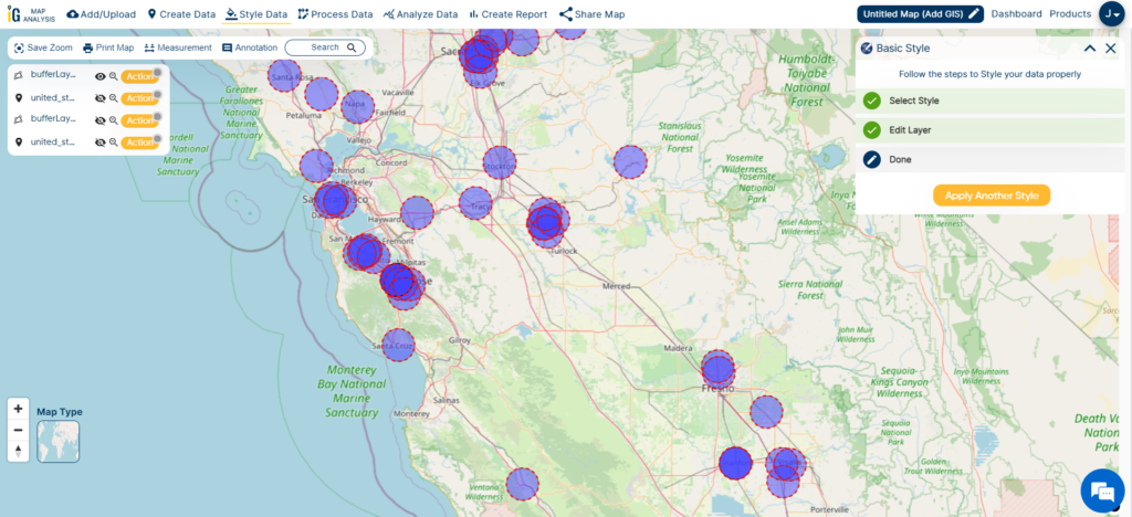
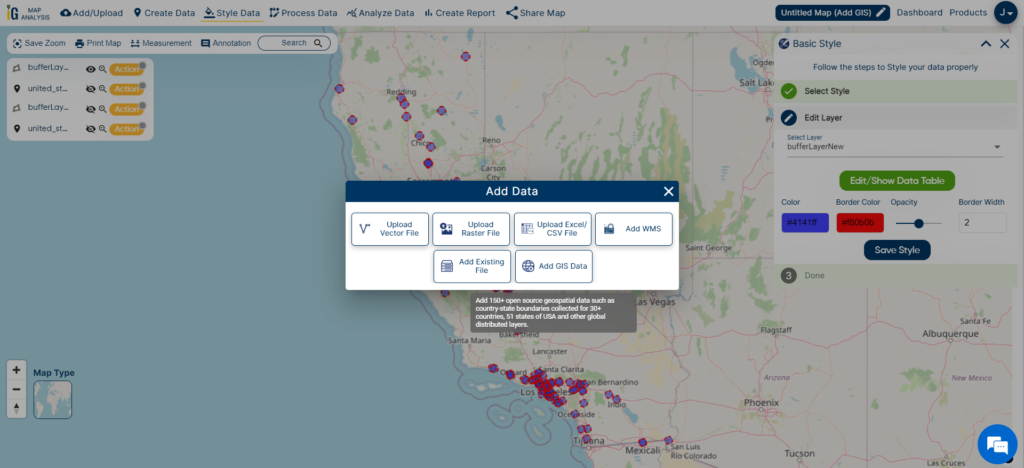
With MAPOG’s versatile toolkit, you can effortlessly upload vector and upload Excel or CSV data, incorporate existing layers, perform polyline splitting, use the converter for various formats, calculate isochrones, and utilize the Export Tool.

For any questions or further assistance, feel free to reach out to us at support@mapog.com. We’re here to help you make the most of your GIS data.

Download Shapefile for the following:

  1. World Countries Shapefile
  2. Australia
  3. Argentina
  4. Austria
  5. Belgium
  6. Brazil
  7. Canada
  8. Denmark
  9. Fiji
  10. Finland
  11. Germany
  12. Greece
  13. India
  14. Indonesia
  15. Ireland
  16. Italy
  17. Japan
  18. Kenya
  19. Lebanon
  20. Madagascar
  21. Malaysia
  22. Mexico
  23. Mongolia
  24. Netherlands
  25. New Zealand
  26. Nigeria
  27. Papua New Guinea
  28. Philippines
  29. Poland
  30. Russia
  31. Singapore
  32. South Africa
  33. South Korea
  34. Spain
  35. Switzerland
  36. Tunisia
  37. United Kingdom Shapefile
  38. United States of America
  39. Vietnam
  40. Croatia
  41. Chile
  42. Norway
  43. Maldives
  44. Bhutan
  45. Colombia
  46. Libya
  47. Comoros
  48. Hungary
  49. Laos
  50. Estonia
  51. Iraq
  52. Portugal
  53. Azerbaijan
  54. Macedonia
  55. Romania
  56. Peru
  57. Marshall Islands
  58. Slovenia
  59. Nauru
  60. Guatemala
  61. El Salvador
  62. Afghanistan
  63. Cyprus
  64. Syria
  65. Slovakia
  66. Luxembourg
  67. Jordan
  68. Armenia
  69. Haiti And Dominican Republic
  70. Malta
  71. Djibouti
  72. East Timor
  73. Micronesia
  74. Morocco
  75. Liberia
  76. Kosovo
  77. Isle Of Man
  78. Paraguay
  79. Tokelau
  80. Palau
  81. Ile De Clipperton
  82. Mauritius
  83. Equatorial Guinea
  84. Tonga
  85. Myanmar
  86. Thailand
  87. New Caledonia
  88. Niger
  89. Nicaragua
  90. Pakistan
  91. Nepal
  92. Seychelles
  93. Democratic Republic of the Congo
  94. China
  95. Kenya
  96. Kyrgyzstan
  97. Bosnia Herzegovina
  98. Burkina Faso
  99. Canary Island
  100. Togo
  101. Israel And Palestine
  102. Algeria
  103. Suriname
  104. Angola
  105. Cape Verde
  106. Liechtenstein
  107. Taiwan
  108. Turkmenistan
  109. Tuvalu
  110. Ivory Coast
  111. Moldova
  112. Somalia
  113. Belize
  114. Swaziland
  115. Solomon Islands
  116. North Korea
  117. Sao Tome And Principe
  118. Guyana
  119. Serbia
  120. Senegal And Gambia
  121. Faroe Islands
  122. Guernsey Jersey
  123. Monaco
  124. Tajikistan
  125. Pitcairn

Disclaimer : The GIS data provided for download in this article was initially sourced from OpenStreetMap (OSM) and further modified to enhance its usability. Please note that the original data is licensed under the Open Database License (ODbL) by the OpenStreetMap contributors. While modifications have been made to improve the data, any use, redistribution, or modification of this data must comply with the ODbL license terms. For more information on the ODbL, please visit OpenStreetMap’s License Page.

Here are some blogs you might be interested in:

Mapping Healthcare Efficiency: GIS Buffer Analysis of Hospital Locations


In this article, my primary goal is to show you, from my perspective as a healthcare official, how I effectively use buffer analysis techniques with hospital point data specific to California. Throughout this article, I’ll walk you through the steps within MAPOG‘s GIS Buffer Analysis of hospital locations, a resource I personally consider indispensable in my role.

The core of this spatial analysis is about uncovering crucial insights into the geographic relationships and proximity of hospital locations within the state. By following the instructions provided here, you’ll gain a clear understanding of how I create buffers around these hospital points. These buffers, which are part of my responsibilities, reveal important spatial patterns and distribution insights regarding healthcare facilities in California. It’s a powerful tool that assists me in making informed decisions to enhance healthcare access and quality in our state.

Buffer Analysis

Buffer analysis is a spatial analysis technique used in geographic information systems (GIS) to create a zone or area of influence around a particular geographic feature, such as a point, line, or polygon. This zone, known as a buffer, is typically defined by a specified distance or radius and is used to analyze spatial relationships, proximity, and accessibility between features. Buffer analysis is valuable for various applications, including urban planning, environmental impact assessment, and determining service areas around facilities like hospitals, schools, or stores.

Below are the steps for Buffer Analysis of hospital locations

Step 1 – Select Buffer Tool

To initiate a buffer analysis using MAPOG, I begin by opening the application. Subsequently, I proceed to select the Buffer Tool, which is my preferred choice for adding data for in-depth spatial analysis.

Buffer Analysis Tool

Step 2 – Select Country

Once the Buffer Tool is selected, my next step involves choosing the specific geographical region for analysis. In this particular case, I opt to analyze the state of California, a region of paramount importance for healthcare planning and resource allocation.

Select Country
Select Country

Step 3 – Select the Data Set


After choosing California for analysis, the next vital step is to smoothly add the hospital points dataset to the project. This dataset is fundamental to our thorough buffer analysis, enabling us to understand how healthcare facilities are distributed and accessible throughout the state.

GIS Buffer Analysis of hospital locations
Hospital Points

Step 4 – Create the Buffer Zone

With the hospital points dataset in hand, my next task is to define the buffer zone around these critical locations. To create a buffer with a radius of 5000 meters, I simply input “5000m” into the designated box, precisely specifying the desired buffer distance for the analysis. This step is pivotal in examining the spatial relationships and accessibility of healthcare facilities within the state of California.

Buffer Zone 5000m
Buffer Zone 5000m

After the initial buffer creation, I proceed to provide a more comprehensive illustration of hospital accessibility. This involves adding a second buffer with a radius of 10,000 meters, showcasing the typical range within which hospitals should ideally be accessible, typically ranging from 5 to 10 kilometers. This step is instrumental in highlighting the areas where healthcare services should be readily available to ensure optimal coverage and accessibility for the residents of California.

Buffer Zone 10000m
Buffer Zone 10000m

Step 5 – Add Other Feature Layers

To achieve a more thorough analysis and better grasp hospital distribution in California, I strategically choose to include county and city/town data in the project. This additional dataset significantly improves our comprehension by offering valuable context and insights into how healthcare facilities are spread across various administrative regions in the state. By examining the spatial connection between hospitals and these administrative boundaries, I can develop a more nuanced understanding of healthcare accessibility and resource allocation.


To easily enhance my project with county and city/town data, I use the “Add/Upload” option found in the upper-left corner of MAPOG’s interface. This valuable feature allows me to smoothly integrate extra geographic datasets, adding depth and context to my spatial analysis. This helps me conduct a comprehensive and insightful examination of hospital distribution in California.

Add Data
Add Data

Result And Analysis

As I combine county borders, city/town data, and hospital buffer zones (5000m in blue and 10000m in red), my aim is to decipher the intricate patterns and factors affecting hospital distribution in California.

The different buffer colors, blue and red, act as important visual aids. They assist me in assessing how easily healthcare facilities can be reached within different administrative areas of the state.

GIS Buffer Analysis of hospital locations
Buffer Zones and Cities

As I analyze the image, a distinct pattern becomes evident: hospitals are notably concentrated within city regions, highlighted in green. This pattern resonates with my understanding of higher healthcare service demand in urban areas, owing to their greater population density and improved transportation access.

This observation underscores the critical importance of strategic healthcare planning and resource allocation. It highlights the imperative to address healthcare disparities, ensuring equitable access to medical services not only in thriving urban centers but also in the more remote or underserved regions across California.

GIS Buffer Analysis of hospital locations
Result and Analysis

When I examine the image, I clearly observe that hospitals do not have an even distribution across California’s counties. The reason for this uneven distribution is the varying population densities in different regions. It’s a reminder that when it comes to placing healthcare facilities, we must consider population and urbanization factors carefully. This understanding guides our healthcare planning and resource allocation efforts to ensure everyone in California gets the care they need, regardless of where they live.

As a healthcare officer, I find the results of this buffer analysis to be incredibly valuable for our strategic healthcare planning and resource allocation efforts. Here’s how we can put this information to good use:

Findings and Factors to Consider

  1. Identify High-Traffic Hospitals: The buffer analysis helps us pinpoint hospitals within the 5000m (blue) and 10000m (red) zones, revealing those with higher patient visitation rates. This insight helps us understand where healthcare services are in high demand.
  2. Capacity Assessment: We can assess the capacity and readiness of these hospitals to meet patient demand. This assessment may prompt decisions about expansions or improvements to ensure these high-traffic facilities can provide quality care efficiently.
  3. Identify Underserved Areas: The analysis highlights regions with limited hospital access, particularly outside the buffer zones. These areas represent potential locations for establishing new healthcare facilities, addressing gaps in service coverage.
  4. Emergency Response Planning: We can strategically position hospitals based on geographical distribution insights, ensuring efficient emergency response capabilities across the region.
  5. Resource Allocation: The data helps us allocate resources effectively, whether it involves redistributing medical personnel, investing in new infrastructure, or deploying mobile healthcare units to reach underserved regions and improve healthcare access.
  6. Community Health Promotion: We use insights from the analysis to inform our community health promotion and awareness programs, especially benefiting underserved communities with limited healthcare access.
  7. Transparency and Public Engagement: Sharing analysis results with the public and local stakeholders fosters transparency and encourages valuable input into healthcare planning decisions.

I’ve found that utilizing MAPOG’s buffer analysis tool has been pivotal in uncovering these spatial patterns and revealing essential insights for our research.

In this case, we’ve harnessed its capabilities to gain a deeper understanding of healthcare accessibility and distribution, emphasizing the role of urban areas in healthcare infrastructure. This article serves as a testament to the value of MAPOG’s GIS Buffer Analysis of hospital locations in spatial research and planning, offering a practical and clear path to unlocking geographic insights.

Here are some other blogs you might be interested in:
💬 Book a Meeting