It’s fantastic to hear that MAPOG has expanded its GIS data collection to include data for more than 100 new countries, bringing the total coverage to over 150 countries. This is undoubtedly a valuable resource for GIS enthusiasts and professionals around the world. The availability of detailed information on administrative divisions, rivers, roads, and airports can greatly enhance various geospatial projects and analyses.
The option to access the data through tools like “Download GIS Data” and “Add GIS Data” seems convenient and user-friendly. Providing data in different formats such as Shapefile, KML, GeoJSON, and CSV ensures compatibility with a wide range of GIS software and applications, making it easier for users to integrate the data into their workflows.
This article will walk you through downloading administrative-level GIS data for Tonga using the Download GIS Data tool. Experience a seamless geospatial journey with MAPOG as your trusted partner!
Note:
All data available are in GCS datum EPSG:4326 WGS84 CRS (Coordinate Reference System).
You need to login for downloading the shapefile.
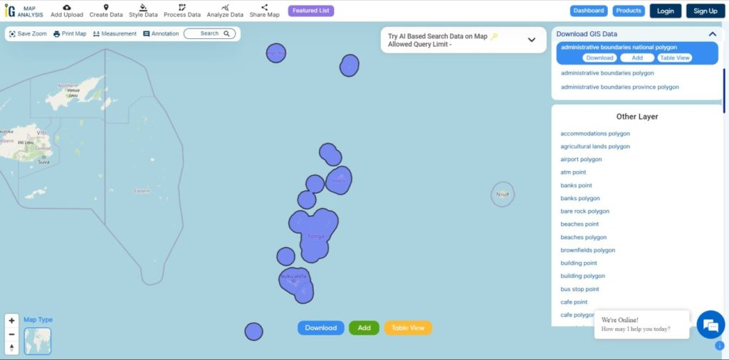
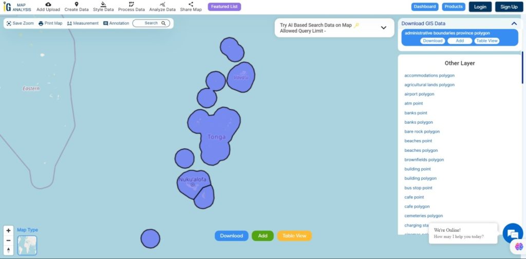
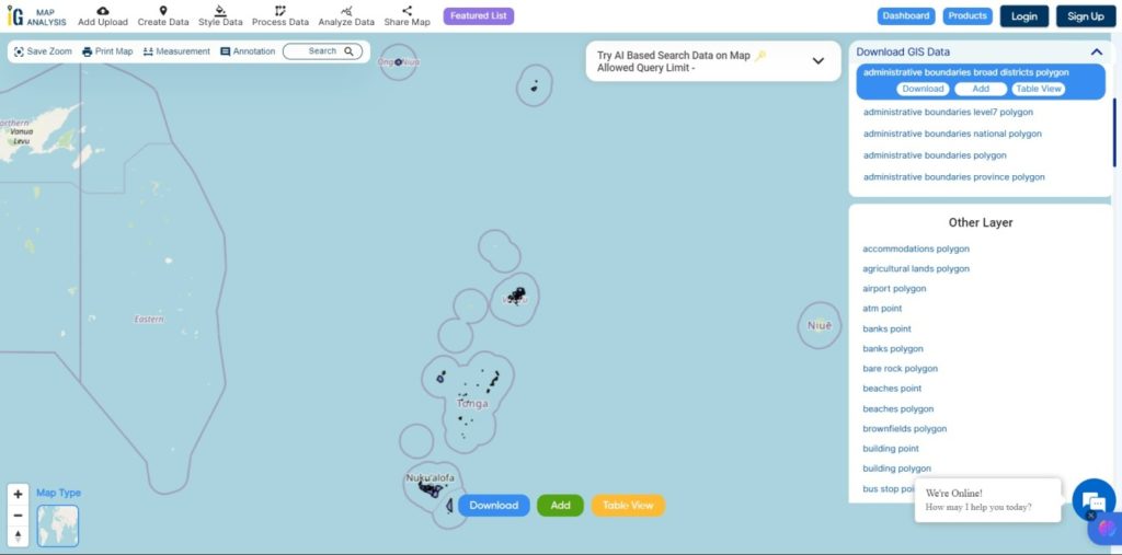
Download Shapefile Data of Tonga
Tonga is an archipelago located in Oceania, situated in the South Pacific Ocean. These islands are categorized into three main groups: Vava’u, Ha’apai, and Tongatapu. They span an 800-kilometre (500-mile)-long north-south line.
Tonga experiences a tropical rainforest climate (Af). It has a distinct warm period from December to April, during which temperatures exceed 32°C (89.6°F). The cooler period lasts from May to November, with temperatures rarely surpassing 27°C (80.6°F). The temperature and rainfall vary across the islands, ranging from 23°C (73.4°F) and 1,700 mm (66.9 in) on Tongatapu in the south to 27°C (80.6°F) and 2,970 mm (116.9 in) on the more northerly islands closer to the Equator.
Disclaimer : If you find any shapefile data of country provided is incorrect do contact us or comment below, so that we will correct the same in our system as well we will try to correct the same in OpenStreetMap.
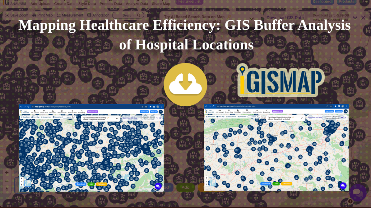
In this article, my primary goal is to show you, from my perspective as a healthcare official, how I effectively use buffer analysis techniques with hospital point data specific to California. Throughout this article, I’ll walk you through the steps within MAPOG‘s GIS Buffer Analysis of hospital locations, a resource I personally consider indispensable in my role.
The core of this spatial analysis is about uncovering crucial insights into the geographic relationships and proximity of hospital locations within the state. By following the instructions provided here, you’ll gain a clear understanding of how I create buffers around these hospital points. These buffers, which are part of my responsibilities, reveal important spatial patterns and distribution insights regarding healthcare facilities in California. It’s a powerful tool that assists me in making informed decisions to enhance healthcare access and quality in our state.
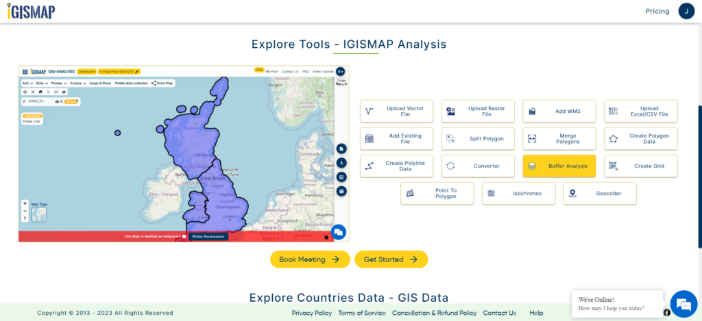
Buffer Analysis
Buffer analysis is a spatial analysis technique used in geographic information systems (GIS) to create a zone or area of influence around a particular geographic feature, such as a point, line, or polygon. This zone, known as a buffer, is typically defined by a specified distance or radius and is used to analyze spatial relationships, proximity, and accessibility between features. Buffer analysis is valuable for various applications, including urban planning, environmental impact assessment, and determining service areas around facilities like hospitals, schools, or stores.
Below are the steps for Buffer Analysis of hospital locations
Step 1 – Select Buffer Tool
To initiate a buffer analysis using MAPOG, I begin by opening the application. Subsequently, I proceed to select the Buffer Tool, which is my preferred choice for adding data for in-depth spatial analysis.
Buffer Analysis Tool
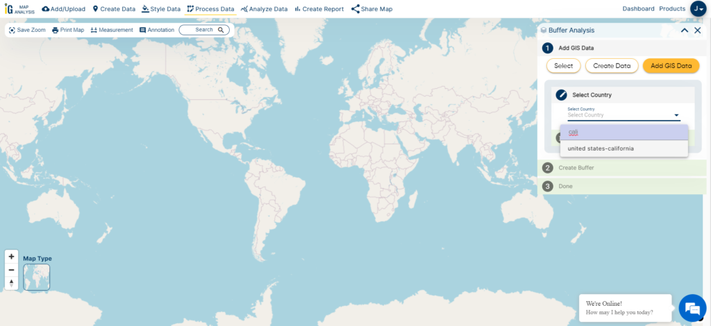
Step 2 – Select Country
Once the Buffer Tool is selected, my next step involves choosing the specific geographical region for analysis. In this particular case, I opt to analyze the state of California, a region of paramount importance for healthcare planning and resource allocation.
Select Country
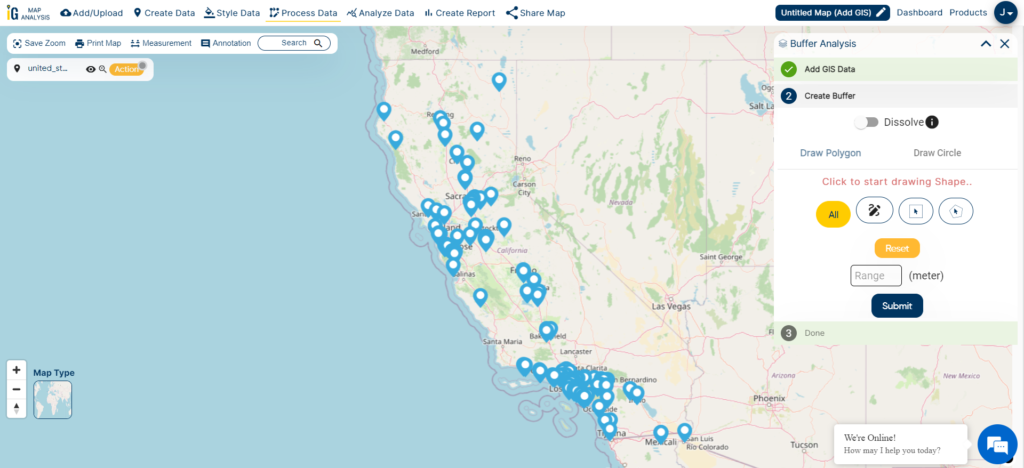
Step 3 – Select the Data Set
After choosing California for analysis, the next vital step is to smoothly add the hospital points dataset to the project. This dataset is fundamental to our thorough buffer analysis, enabling us to understand how healthcare facilities are distributed and accessible throughout the state.
Hospital Points
Step 4 – Create the Buffer Zone
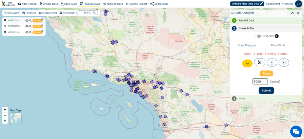
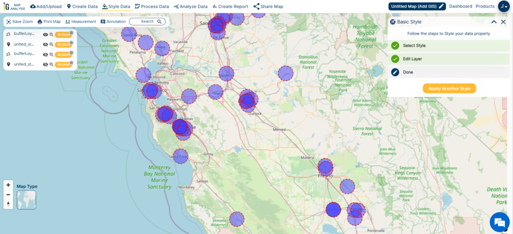
With the hospital points dataset in hand, my next task is to define the buffer zone around these critical locations. To create a buffer with a radius of 5000 meters, I simply input “5000m” into the designated box, precisely specifying the desired buffer distance for the analysis. This step is pivotal in examining the spatial relationships and accessibility of healthcare facilities within the state of California.
Buffer Zone 5000m
After the initial buffer creation, I proceed to provide a more comprehensive illustration of hospital accessibility. This involves adding a second buffer with a radius of 10,000 meters, showcasing the typical range within which hospitals should ideally be accessible, typically ranging from 5 to 10 kilometers. This step is instrumental in highlighting the areas where healthcare services should be readily available to ensure optimal coverage and accessibility for the residents of California.
Buffer Zone 10000m
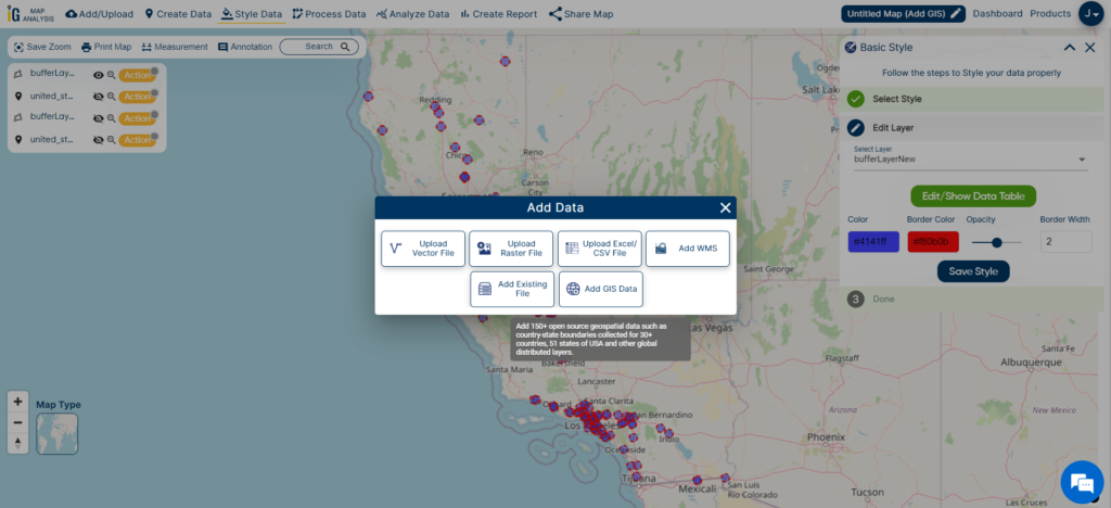
Step 5 – Add Other Feature Layers
To achieve a more thorough analysis and better grasp hospital distribution in California, I strategically choose to include county and city/town data in the project. This additional dataset significantly improves our comprehension by offering valuable context and insights into how healthcare facilities are spread across various administrative regions in the state. By examining the spatial connection between hospitals and these administrative boundaries, I can develop a more nuanced understanding of healthcare accessibility and resource allocation.
To easily enhance my project with county and city/town data, I use the “Add/Upload” option found in the upper-left corner of MAPOG’s interface. This valuable feature allows me to smoothly integrate extra geographic datasets, adding depth and context to my spatial analysis. This helps me conduct a comprehensive and insightful examination of hospital distribution in California.
Add Data
Result And Analysis
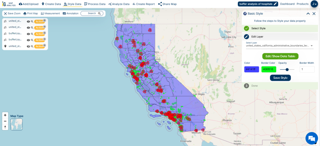
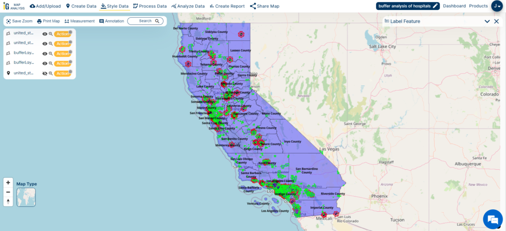
As I combine county borders, city/town data, and hospital buffer zones (5000m in blue and 10000m in red), my aim is to decipher the intricate patterns and factors affecting hospital distribution in California.
The different buffer colors, blue and red, act as important visual aids. They assist me in assessing how easily healthcare facilities can be reached within different administrative areas of the state.
Buffer Zones and Cities
As I analyze the image, a distinct pattern becomes evident: hospitals are notably concentrated within city regions, highlighted in green. This pattern resonates with my understanding of higher healthcare service demand in urban areas, owing to their greater population density and improved transportation access.
This observation underscores the critical importance of strategic healthcare planning and resource allocation. It highlights the imperative to address healthcare disparities, ensuring equitable access to medical services not only in thriving urban centers but also in the more remote or underserved regions across California.
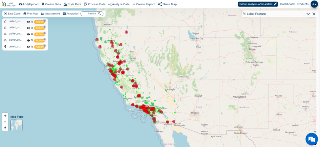
Result and Analysis
When I examine the image, I clearly observe that hospitals do not have an even distribution across California’s counties. The reason for this uneven distribution is the varying population densities in different regions. It’s a reminder that when it comes to placing healthcare facilities, we must consider population and urbanization factors carefully. This understanding guides our healthcare planning and resource allocation efforts to ensure everyone in California gets the care they need, regardless of where they live.
As a healthcare officer, I find the results of this buffer analysis to be incredibly valuable for our strategic healthcare planning and resource allocation efforts. Here’s how we can put this information to good use:
Findings and Factors to Consider
Identify High-Traffic Hospitals: The buffer analysis helps us pinpoint hospitals within the 5000m (blue) and 10000m (red) zones, revealing those with higher patient visitation rates. This insight helps us understand where healthcare services are in high demand.
Capacity Assessment: We can assess the capacity and readiness of these hospitals to meet patient demand. This assessment may prompt decisions about expansions or improvements to ensure these high-traffic facilities can provide quality care efficiently.
Identify Underserved Areas: The analysis highlights regions with limited hospital access, particularly outside the buffer zones. These areas represent potential locations for establishing new healthcare facilities, addressing gaps in service coverage.
Emergency Response Planning: We can strategically position hospitals based on geographical distribution insights, ensuring efficient emergency response capabilities across the region.
Resource Allocation: The data helps us allocate resources effectively, whether it involves redistributing medical personnel, investing in new infrastructure, or deploying mobile healthcare units to reach underserved regions and improve healthcare access.
Community Health Promotion: We use insights from the analysis to inform our community health promotion and awareness programs, especially benefiting underserved communities with limited healthcare access.
Transparency and Public Engagement: Sharing analysis results with the public and local stakeholders fosters transparency and encourages valuable input into healthcare planning decisions.
I’ve found that utilizing MAPOG’s buffer analysis tool has been pivotal in uncovering these spatial patterns and revealing essential insights for our research.
In this case, we’ve harnessed its capabilities to gain a deeper understanding of healthcare accessibility and distribution, emphasizing the role of urban areas in healthcare infrastructure. This article serves as a testament to the value of MAPOG’s GIS Buffer Analysis of hospital locations in spatial research and planning, offering a practical and clear path to unlocking geographic insights.
We use cookies to ensure that we give you the best experience on our website. If you continue to use this site we will assume that you are happy with it.