Number chart in map makes easy to understand and analyse data because it shows your data in statistics which helps in better understanding . After creating or uploading data to IGISmap you can represent data in different forms.
IGISmap provides different types of charts and graph like Number Chart, Histogram Range Plot, Multi-Layer Relation Bar Chart, Single Layer Bar Chart, and Data Table.
You can make multiple charts along with map and can compare different type of data in a particular region.
Sample Use Case Of Number Chart In Map
Sample use case should be treated as an example because it gives a brief about the tool .Which helps in understanding the tool in a better manner.
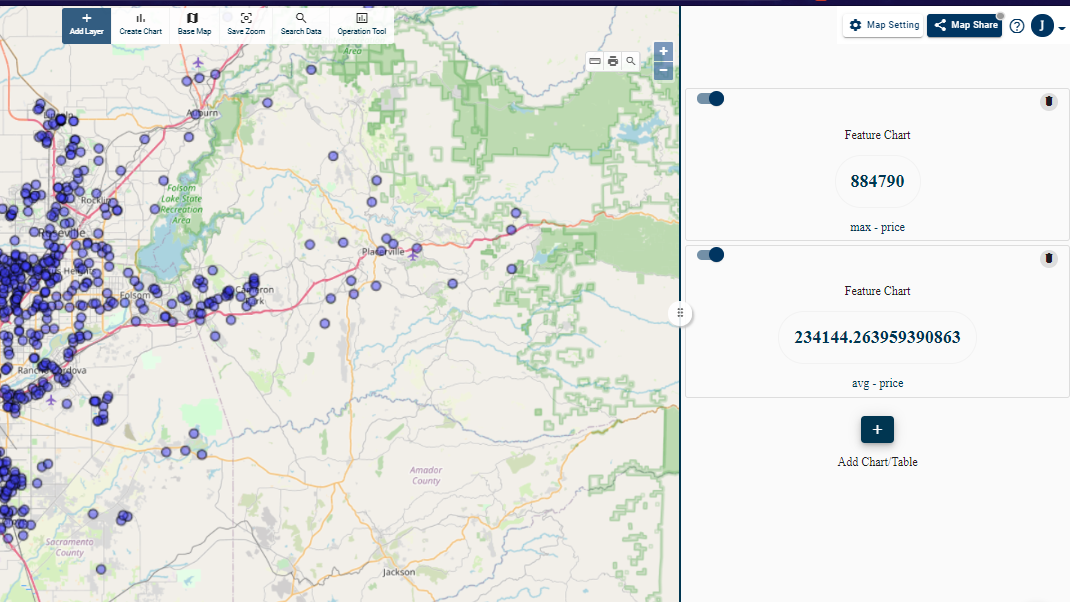
For instance suppose we have a large data set of available flats in a city. That city is having several smaller regions. The data contains number of bed rooms, number of washrooms, area, cost etc of that flat.
Now we can analyse such data spatially as well as with charts and graphs simultaneously with the help of IGISmap because it will make your data much easier to understand and visualize.
We can make a chart of average cost, max area, or any other arithmetic operations within data and display alongside with map.
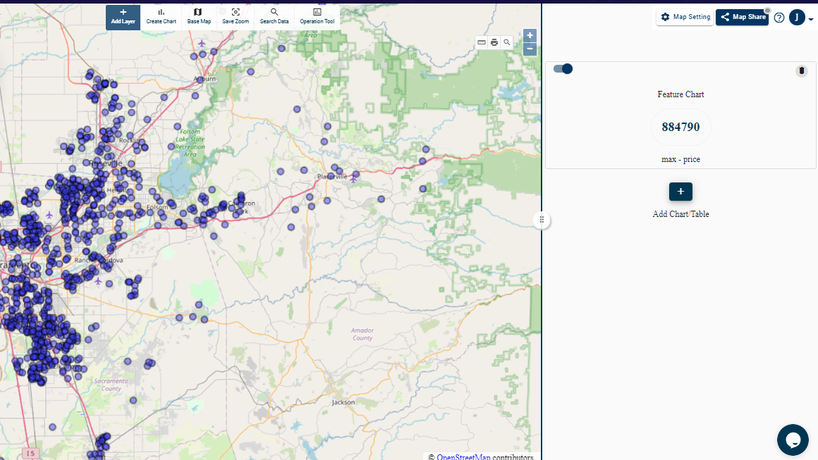
Number Chart In Map
Like the name suggests Number Chart in map counts a particular feature within a region. In IGISmap this tool counts features in the visible area of map. That means the portion of map that you can see on screen, only feature of that portion will be considered and a chart will be created accordingly.
For Instance, You can create charts for Minimum Maximum Average or Sum of different features.
Steps to add Number chart in Map
- Login to IGISmap tool And navigate to a map already added by you. If you don’t have any map added, you can add the map easily. Checkout this tutorial to add map. Once the map is created add GIS layer.
- To create Number chart in map, Click on Create Chart button, After clicking on it your desired chart will be created in map.
- Note : Charts can be added to Template with charts and not to a full map.
- The create chart dialog box will appear and it will let you select your desired chart accordingly.
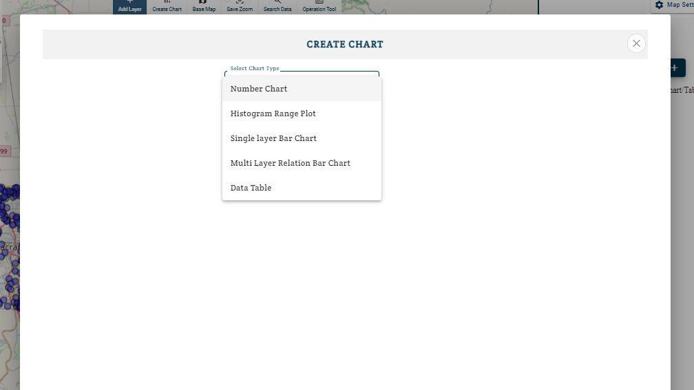
- Select Number Chart.
- Select the layer in which data corresponding to chart is store.
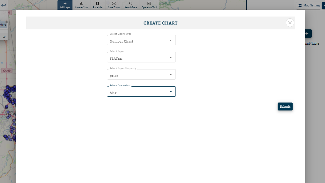
- Choose the attribute corresponding to which features are to be counted.
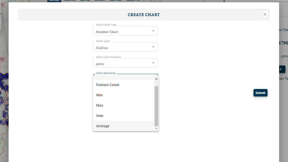
- Select Condition from Sum / average / min / max / feature count / unique count.
Sum– It adds all particular values corresponding to an attribute of different features.
Similarly, Average shows mean, max shows maximum value and min shows minimum value.
Feature Counts – It simply shows number of features in visible region.
Unique Count – It counts the repeated values in data and displays it as a single value because when you have large data to analyse several data values are bound to repeat itself and in order to filter those repeated value and displaying it as a single unit we use unique count.
- Based on your selections a chart will be made alongside the map.
- Now the chart keeps updating as you focus on different areas.
- You can add multiple charts of different types in single map because it makes analyst to focus on different attributes of a data simultaneously.
Easy to use
You can switch interactivity of charts with a slider button corresponding to chart.
Above all you can share this interactive digital maps because the analysis tools will help them in better analysis of their data without disturbing it. These map can be Embedded to your website or blogs. You just need to copy and paste a line of HTML generated for map.
Therefore we can say that you don’t need to have prior knowledge of coding for using it.