Histogram graph in map is a graphical representation of distributed numeric data. To make a histogram some range are to be set and data is also arranged accordingly. The height of graphs shows the frequency of the data.
In IGISmap we can add different charts along with map to analyze the data in different scenario. Histogram can also be added as a chart along with map project. Map represents the geography of the data and further charts such as histogram gives more clear stats of that region.
Histogram Graph with Map
In IGISmap it is very easy to add a chart along with map project. Analysis work can be done better with different charts and graphs. It will be working with map and the area on which user zooms or focus, As a result data of that region will be drawn on histogram.
All charts will show value where the map is zoomed only data from the area of map will be displayed on user screen will be considered in drawing histogram. It gives more clear idea about a region and helps in analyzing different areas with same parameters designed.
Step by Step guide to Add in Map
- Login to IGISmap tool. And navigate to a map already added by you. If you don’t have any map added, you can add the map easily. Checkout this tutorial to add map. Once the map is created add GIS layer.
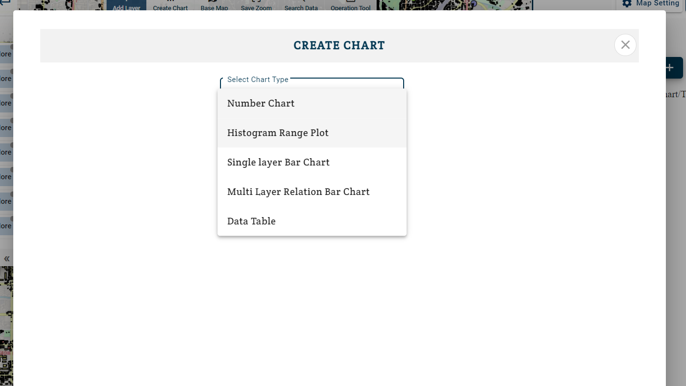
- To create histogram chart in map, Click on Create Chart button.
- Note : Charts can be added to Template with charts and not to a full map.
- Under create chart select “Histogram Range Plot”.
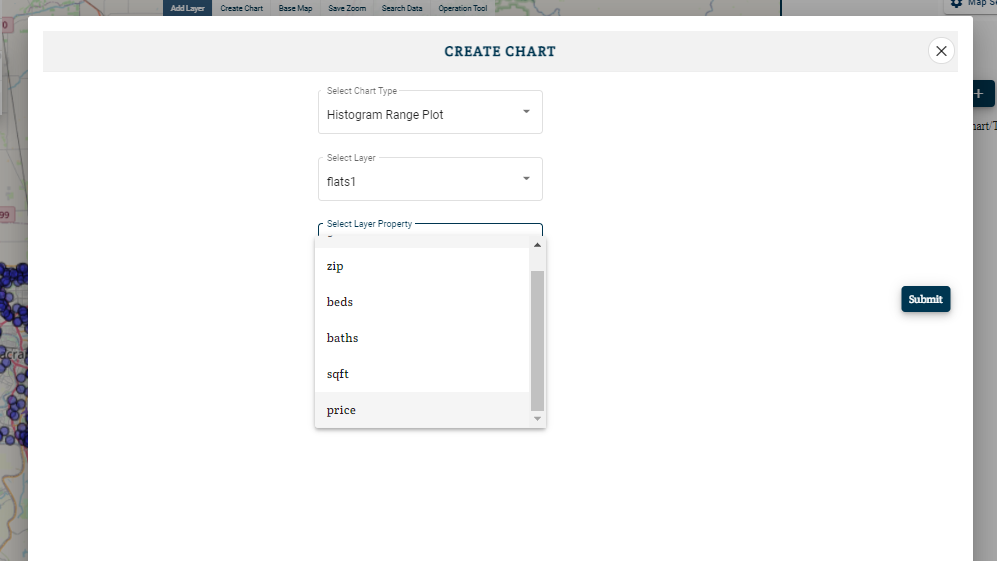
- Then Select layer corresponding to which you want histogram to be drawn.
- Select corresponding properties.
Note:- If you can not see any attribute(property) in drop down list which is in data. Then you need to edit attribute and it will change their data type.
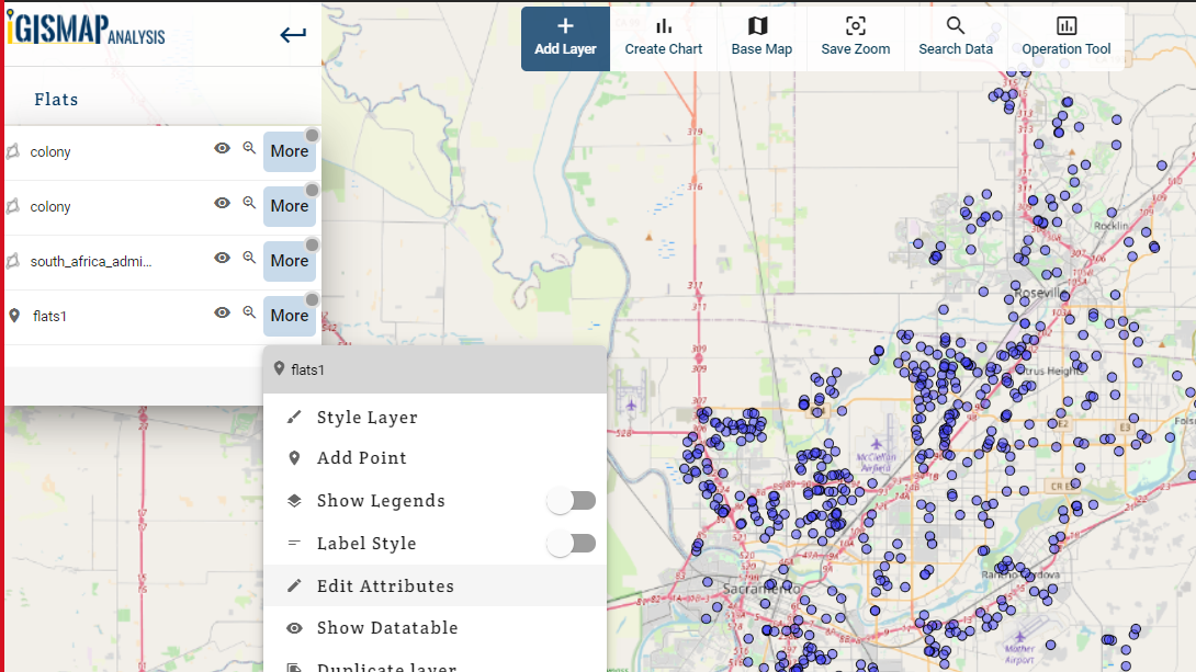
- Close the Create Chart box, click on more options of layer corresponding to which you want to see attribute in chart menu.
- Default data type for any attribute is varchar. Change it to numeric if data is numeric in data corresponding to you attribute.
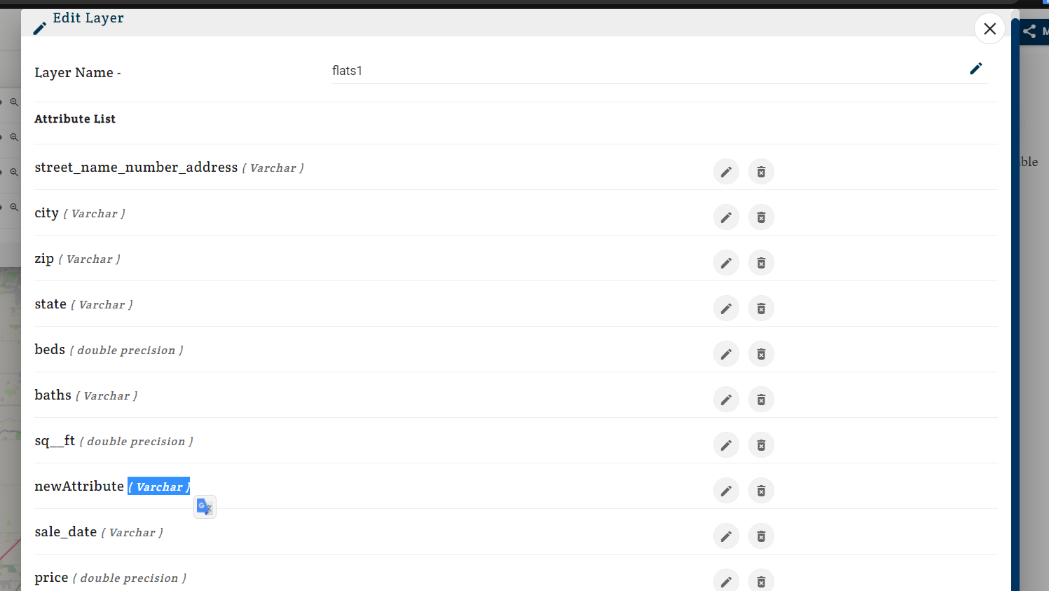
- Click on edit button and a edit box will appear.
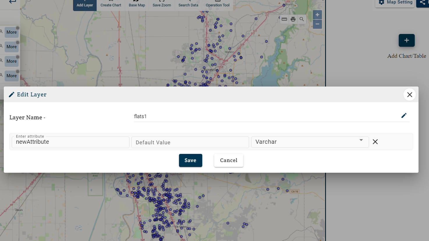
- Change Varchar to numeric. As only numeric data can be used to display on histogram chart.
- Now you can see your attribute while creating Histogram.
- Start from step – 2 and make Histogram.
- Now you have to divide the data in different parts. Each part will represent a range.
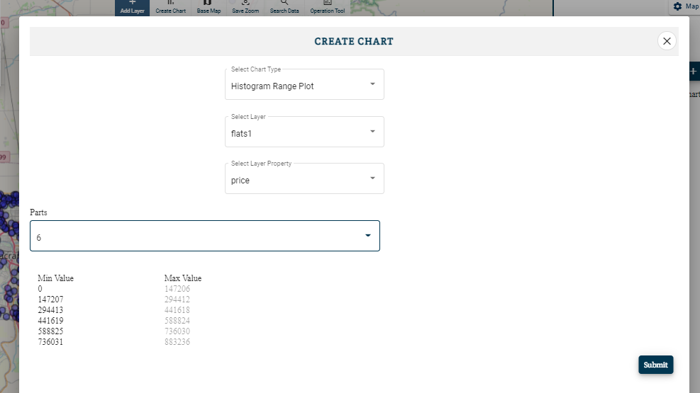
- You can divide your data up to 10 parts and select number of parts as per the needs.
- Click on Submit button.
A histogram graph will be added in the project. You can add multiple charts in a map for better analysis. Charts keep updating according to the map. Their is a switch with each chart you can freeze a chart to a particular instance.
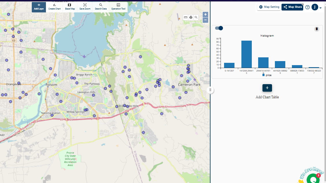
You can zoom to different areas because it will create different scenarios and can freeze the charts with the help of our “interactivity tool” by just turning it off or on. In this way you can have different charts for different areas. Above all the best thing about this tool is that you can also create or embed this map and chart together in your blogs or websites without having any prior knowledge in coding or programming.