The multi-layer bar chart is used to visualize trends and relationships in multiple datasets or layers. Bar chart represents categorial data with rectangular heights in proportion to value. It gives idea of data to user by showing data distribution patterns. Bar Chart in Map makes your BI (Business Intelligence) more powerful.
You can use different sets of data layers to make chart out of their attributes. In this way you can create a number of different relations between different layers. So that you can relate data from different layers and visualize different scenarios on same map.
Steps to add Multi layer Bar chart in map
- Login to IGISmap tool. And navigate to a map already added by you. If you don’t have any map added, you can add the map easily. Once the map is created add GIS layer.
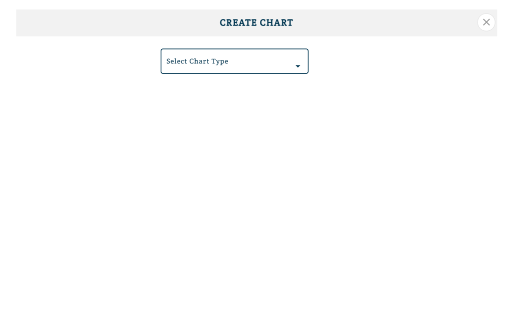
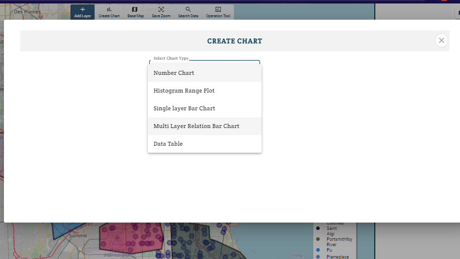
- Click on Create chart. The create chart dialog box will appear.
- Select Chart type and then choose Multi Layer Relational Bar Chart.
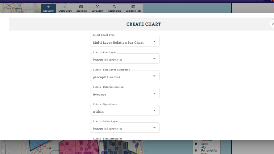
- Now select Layers and attributes to represent on x and y axis. In any graph their are some values which are represented on axes. You can select a layer and then select attribute to be represented on axis.
Select a layer in Y-axis find layer.
Now select an attribute from that layer so that it will be represented on y-axis. Similarly do same corresponding to x -axis such that another layer and its attribute is represented on x- axis.
Note:- If you can not see any attribute(property) in drop down list which is in data. Then you need to edit attribute and it will change their data type.
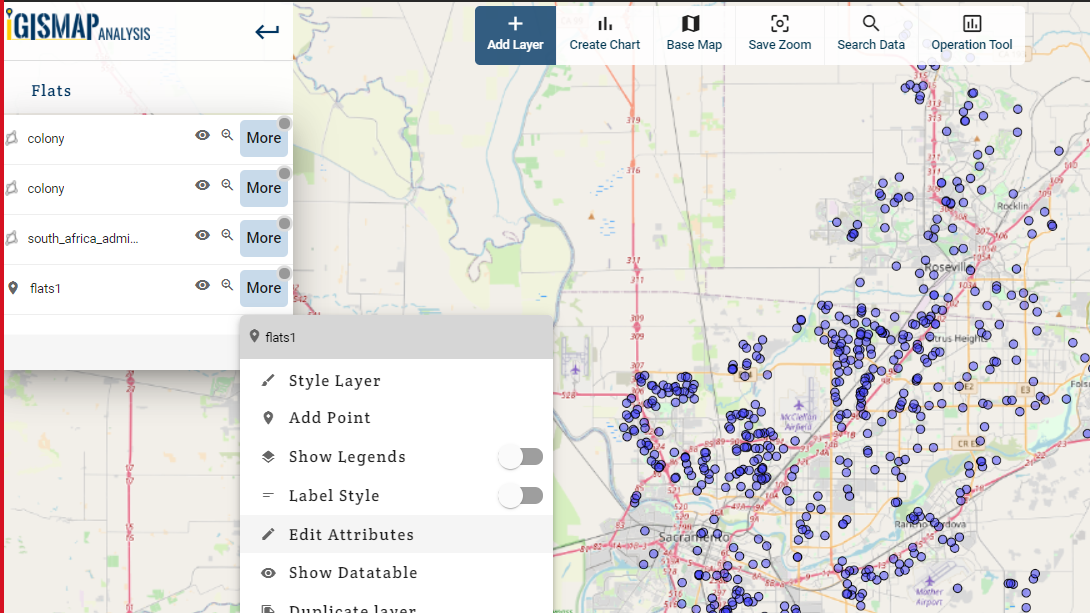
- Close the Create Chart box, click on more options of layer corresponding to which you want to see attribute in chart menu.
- Default data type for any attribute is varchar. Change it to numeric if data is numeric in data corresponding to you attribute.
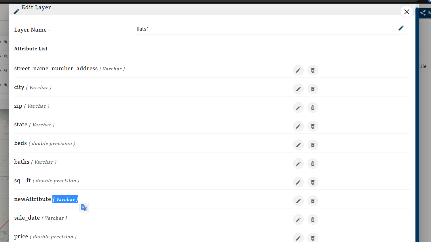
- Click on edit button and a edit box will appear.
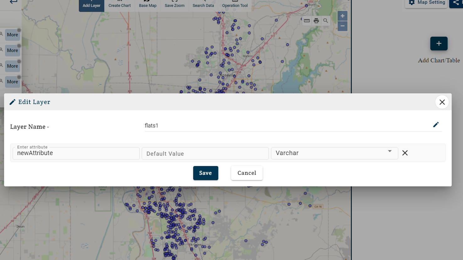
- Change Varchar to numeric. As only numeric data can be used to display on histogram chart.
- Now you can see your attribute while creating Histogram.
- Start from step – 2 and make Multi Layer Bar Chart with Map.
- Click on Submit. Chart will be added.
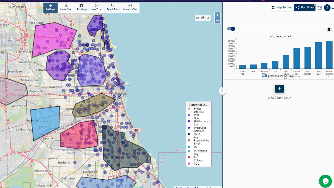
You can use slider along with chart to switch interactivity. Interactive charts shows changes when you zoom to different areas. When you turn of interactivity then it becomes static.
You can share these maps with charts with your team mates with share map feature. They can also use operations without disturbing main data.
These interactive maps can also be Embeded to you website or blogs.