Charts with Map helps users to understand data in a better manner especially the analysis part of it. It is always better to represent data on charts and maps because it gives clear understanding of what data says. IGISmap provides map based data representation along with charts.
You can add different types of charts along with map. Maps represents geographical data patterns and trends. In a map we can also focus on particular parts or areas. In IGISmap charts when a user analyses an area then charts they created also represents data of that area. Charts keep changing with response to area of analysis.
Interactive tool in charts with map
Their is a slider switch corresponding to every chart which switches the interactivity of the chart. With this switch you can switch to static chart. Now data will not change on that chart when you analyze other areas also.
You can create multiple charts for multiple scenarios and can compare them along with map. You can see different numbers and statistical data while zooming to different areas on map.
Types of Charts in IGISmap – Bar Chart, Number Chart, Table
IGISmap provides many charts options some of which are as follow
Single Layer Bar Chart in Map
A bar chart or bar graph is a chart or graph that presents categorical data with rectangular bars with heights or lengths proportional to the values that they represent.
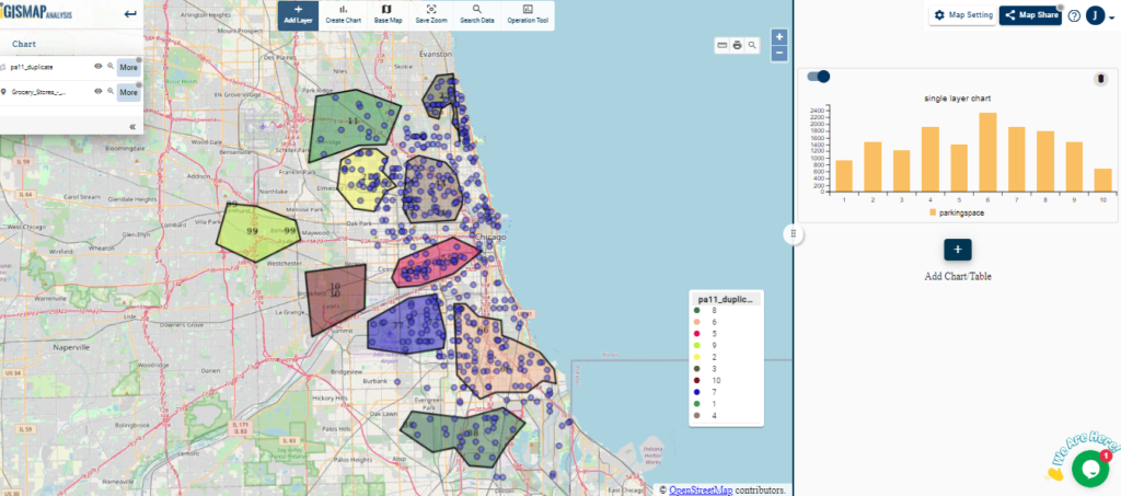
Visit :- Single Layer Bar chart for details
Multi Layer Relation Bar Chart in Map
The multi-layer bar chart is used to visualize trends and relationships in multiple datasets or layers. Bar chart represents categorical data with rectangular heights in proportion to value because it gives idea of data to user by showing data distribution patterns. Bar Chart in Map makes your BI (Business Intelligence) more powerful.
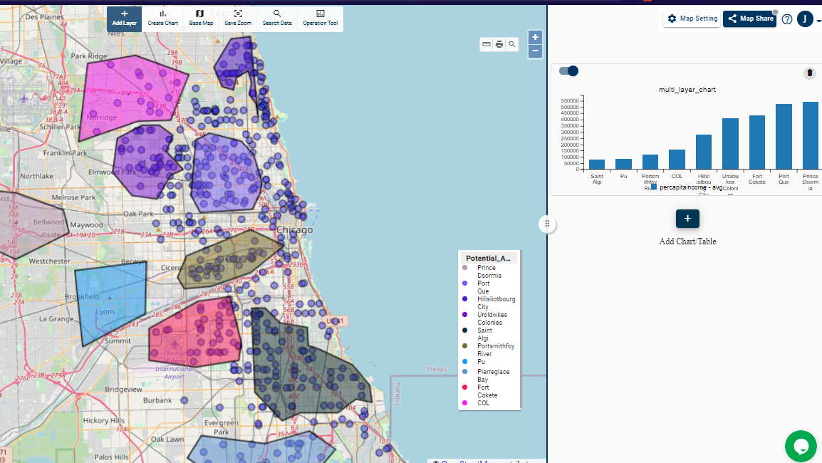
Visit :- Multi Layer Relational Bar Chart for details
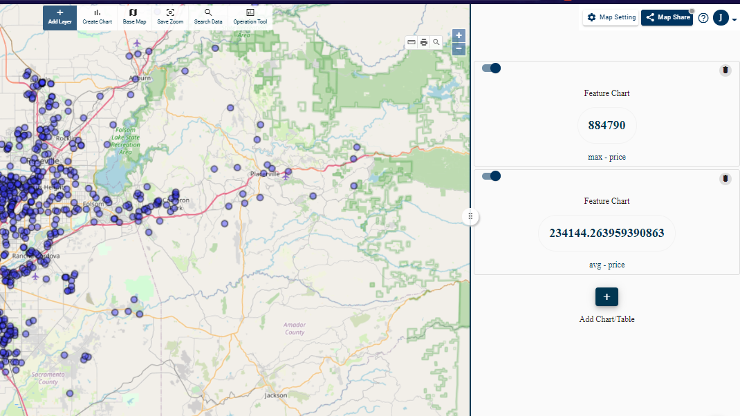
Number Chart in MAP
Number Chart counts a particular feature within an area of analysis and shows it to users. It gives exact figures while analyzing data in a map.
It can simple count number of features. Such as Sum, Average, Max, Min of all features within that area.
Visit :- Number chart for details
Data Table in MAP
Data Tables represents exact data of an area.Also users can select and customize data table charts as per requirements. Only the data fields users wants to view will be shown to user at that time. When ever user analyses different areas tables keep updating accordingly and represents data of that region.
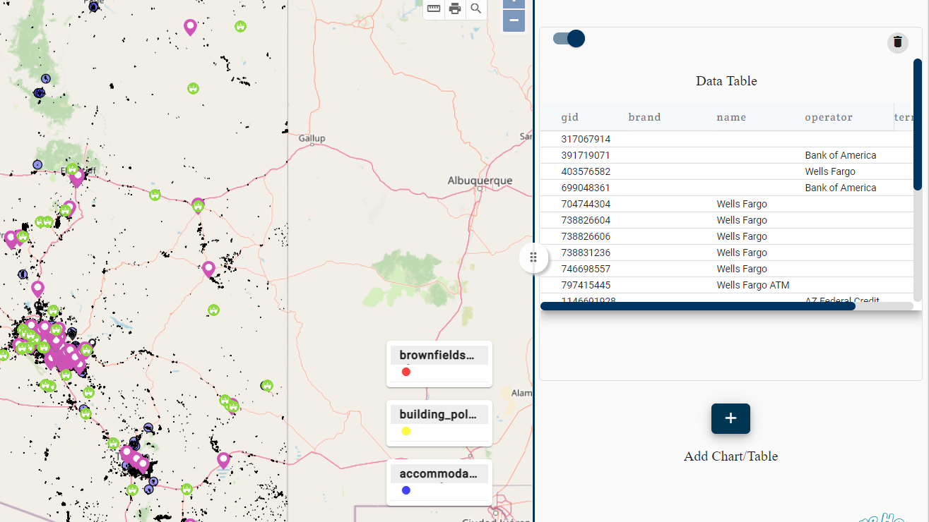
Visit :- Interactive map with Data Table for details
Histogram chart in map
Histogram is a graphical representation of distributed numeric data. To make a histogram some range are to be set and data is also arranged accordingly. The height of graphs shows the frequency of the data.
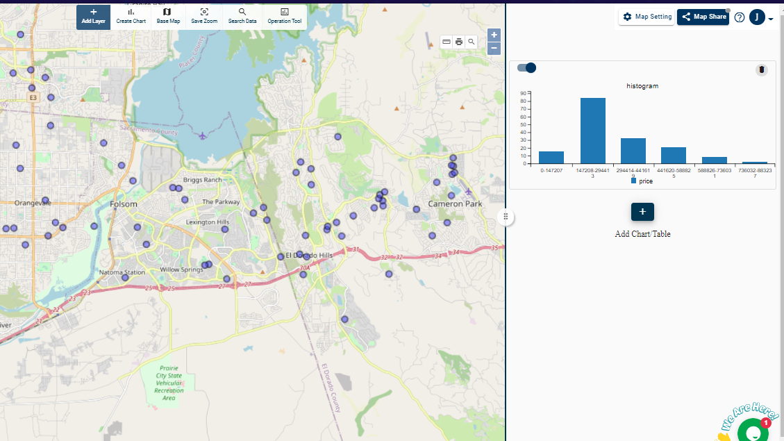
Visit :- Histogram Graph in Map for details.
Easy To Use
Above all you can share this interactive digital maps because the analysis tools will help them in better analysis of their data without disturbing it. These map can be Embedded to your website or blogs. You just need to copy and paste a line of HTML generated for map.
Therefore we can say that you don’t need to have prior knowledge of coding for using it.