GIS helps users to understand patterns, relationships and geographic context. It’s benefits includes improved communication and efficiency that helps in improved management and decision-making. GIS combines datasets with maps, integrated regional datasets with any type of descriptive information or data. It provides mapping and assessment prerequisites for technology and almost every industry.
Visualization and intepretaion methods makes GIS an interesting fields in data analytics. Science of visualization is the core essence in the art of cartography and mapping. Any type of geospatial features presented in the map with proper color combination, accurate size and location helps in better image interpretation. Common visualization methods used in GIS are Quantity and Category stylings.
IGISMap Styling Tools
MAPOG is a web platform providing multiple GIS applications that are most important in the field of geospatial analytics. The peculiarity of IGISMap in the GIS Industry is its UI/UX that helps the user to perform effortless geospatial operations. IGISMap provides the following styling tools:
- Basic Style
- Category Style
- Quantity Style
- Bubble Style
- Icon Style
In IGISMap, Bubble Style and Icon Style are the styling tools for point GIS data, whereas Basic, Category and Quantity styling tools can be applied on polygon and polyline GIS data. Bubble Style visualizes point GIS data quantitatively, while Icon Style will provide proper icons for the points based on the property. Icon Style also has the option to style the points categorically by assigning separate icon for each categories.
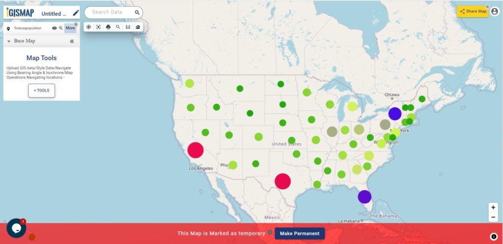
In this article, we will talk about how to quantitatively represent point GIS data using Bubble Style tool of IGISMap. We will walk through each steps to create a map like the following.
Check the following article to know how to style the pins based on categories.
Uploading the data
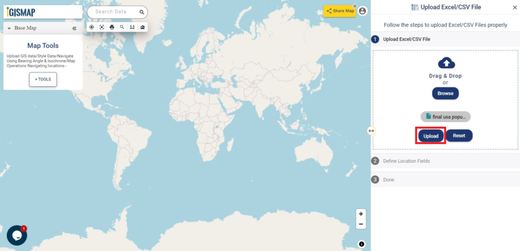
For the demonstration, we will upload a point GIS data into IGISMap. We can either add it in vector format using Upload Vector File tool or in spreadsheet format using Upload CSV/Excel File tool. Here, let’s upload the GIS data of state wise population details of the USA in spreadsheet format with latitude and longitude fields containing the state centroid coordinates.
Click https://story.mapog.com/app/tools/csv-excel to open Upload Excel/CSV File tool.
After opening Upload Excel/CSV File tool, click on Browse and choose the file final_usa_popuplation showing USA state wise population map from the desktop and then Upload it.
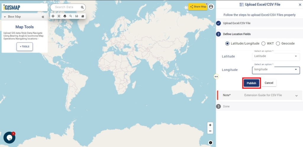
After Upload we have to define the location fields in Define Location Fields section. In the IGISMap there are three options to Define Location Fields from the spreadsheet file:
- Latitude/Longitude
- WKT
- Geocode
Coordinates in our data is saved in separate latitude and longitude columns. Thus we have to select latitude and longitude attribute fields in our data from the dropdown list at appropriate boxes. Then click on Publish to publish the data in the map.
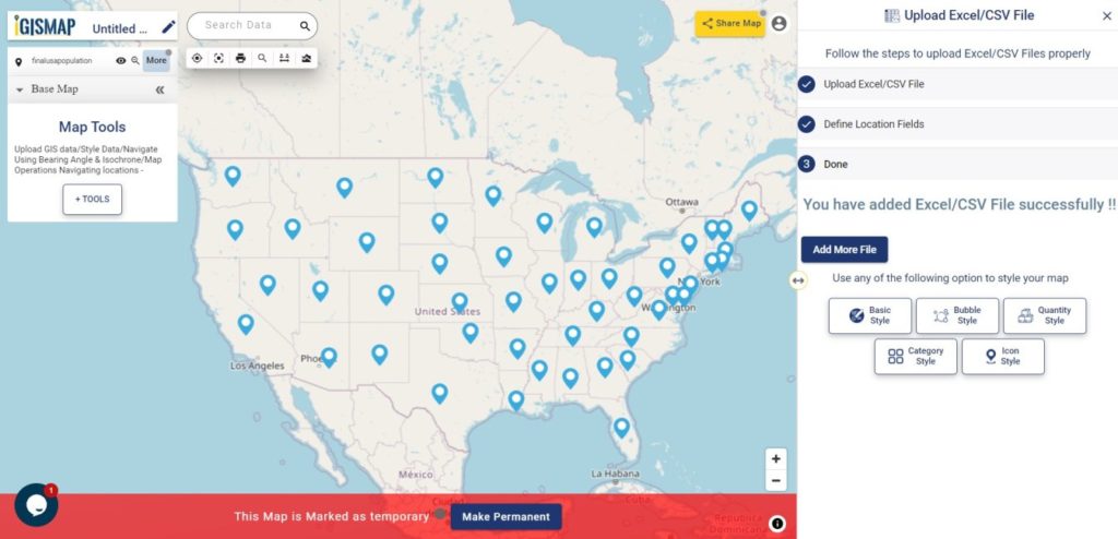
Now the data is published and point is plotted in the map with a default blue pins as shown below.
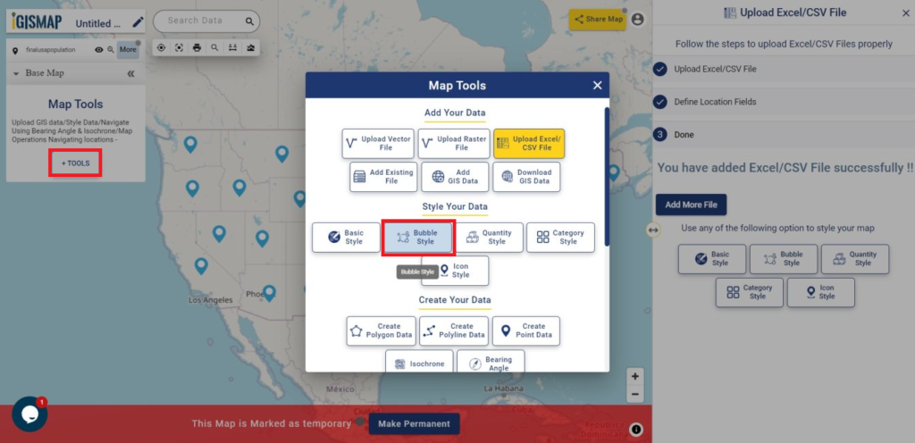
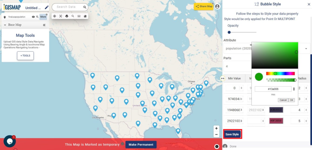
Open IGISMap Bubble Style tool
Lets now open the Bubble Style tool to style the uploaded point data. To access the tool from the map itself, click Tools button from Map Tools section below Base Map tab. This opens a popup with Map Tools where you can select Bubble Style tool listed under Style Your Data section.
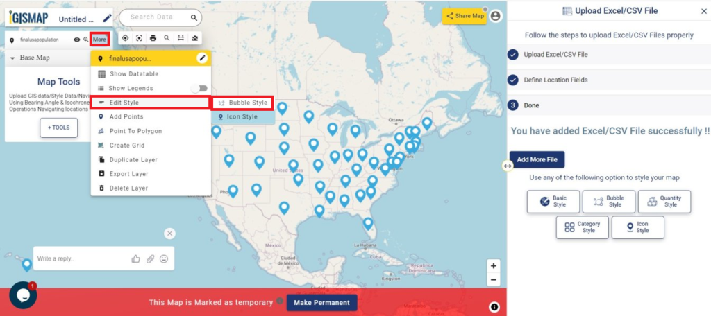
You can also open the Bubble Style tool by going to the More option of input point data and choose the Bubble Style from the Edit Style option.
Convert pins to bubbles
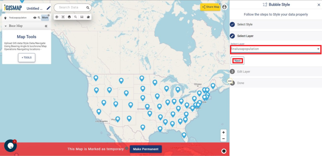
In Bubble Style tool, first step is to select the layer from Select Layer section which is the final_usa_popuplation in our case and click Next.
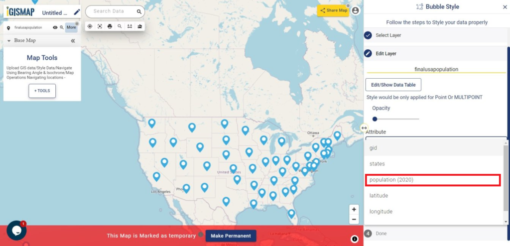
Now the Edit Layer section is opened. Here you can fix the Opacity and choose the Attribute field from which you need to take values for quantitative visualization. Select population_2020 as we need to understand the population distribution in every states of USA in 2020.
When required attribute field is selected, four class of value ranges get listed as default with different color and bubble radius. We can change the Color and bubble Radius for each class by selecting the color, that opens a palette to choose the right color of your choice. After making all changes, click Save Style button to apply this style to the point GIS data.
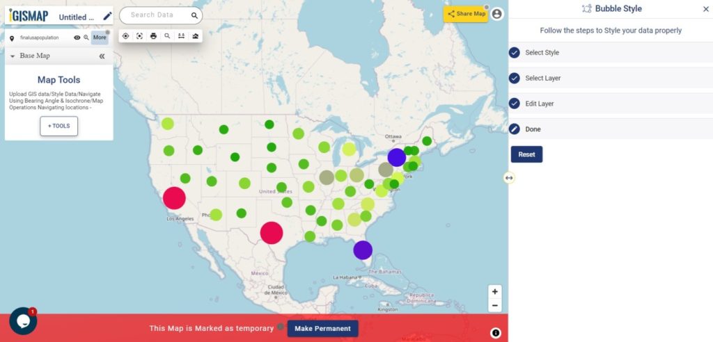
Bubble Style is applied in the point GIS data like the following.
Check the article Share your Map to understand more about Share Map feature of IGISMap.
Also check the article Create GIS Bubble Map – MAPOG Tool
Check other articles:
- Map the locations of slums and embed the map on your website
- Create a Map of the Bank Locations in South India
- Create point data and convert it into polygons
- Download point GIS data from IGISMap
- Charts with Map – Create Bar Chart, Histogram, Number Chart, Table
Check the following IGISMap tools:
- Create Point Data
- Upload Vector File
- Upload CSV/Excel File
- Icon Style
- Download GIS Data