Need accurate regional boundary datasets for mapping and spatial analysis? Download Australia statistical areas level 4 Data easily with GIS Data by MAPOG. The platform provides access to structured geographic datasets in multiple GIS formats such as Shapefile, KML, MID, GeoJSON, CSV, DXF, and many more. Australia Statistical Areas Level 4 datasets are widely used for demographic studies, urban planning, regional analysis, and government reporting because they represent large socio-economic regions with organized statistical boundaries.
Understanding Australia Statistical Areas Level 4 Data
Australia Statistical Areas Level 4 are broad geographic regions created for statistical and administrative analysis. These datasets help users understand regional population distribution, economic activities, infrastructure planning, and service management across large areas. With GIS Data by MAPOG, the data can be visualized, filtered, analyzed, and exported in different GIS-compatible formats for professional workflows.
How to Download Australia Statistical Areas Level 4 Data
GIS Data by MAPOG simplifies the entire process by offering access to hundreds of GIS layers and multiple export formats from a single interface. The platform supports formats including SHP, KML, MID, GeoJSON, SQL, GPX, TOPOJSON, CSV, MIF, and more, making the datasets compatible with most GIS software applications.
Download Australia Statistical Areas Level 4 Data
Note:
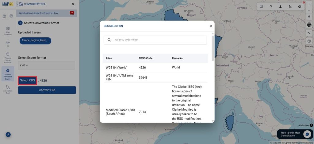
- All datasets are provided in GCS datum EPSG:4326 WGS84 CRS (Coordinate Reference System).
- Users must log in to access and download datasets in their preferred GIS formats.
Step-by-Step Guide to Download Australia Statistical Areas Level 4
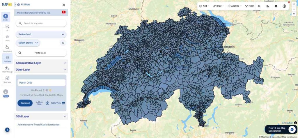
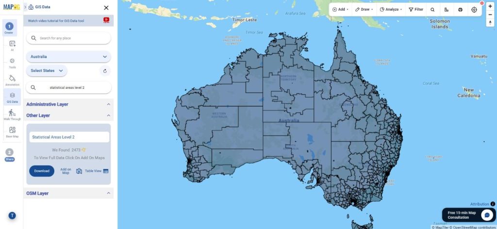
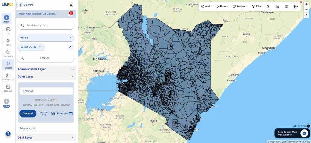
Step 1: Search for the Dataset
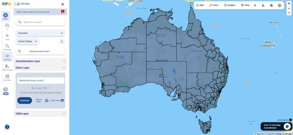
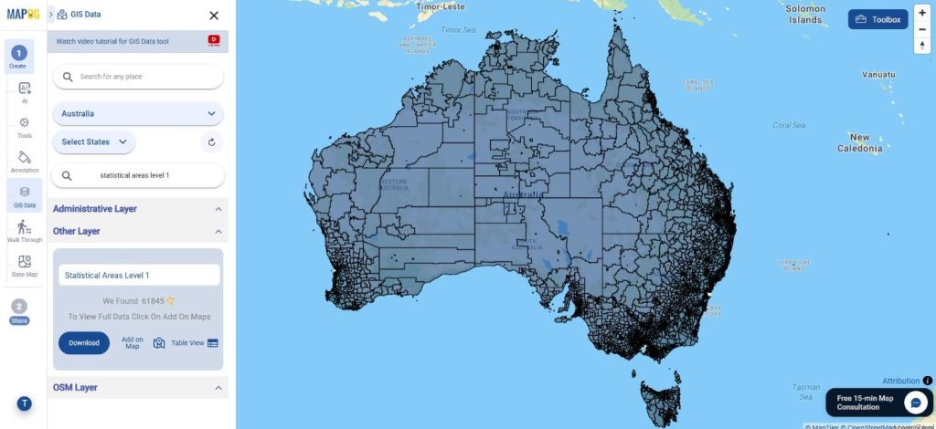
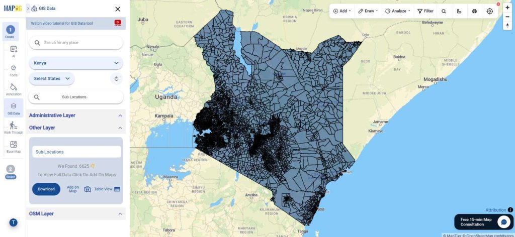
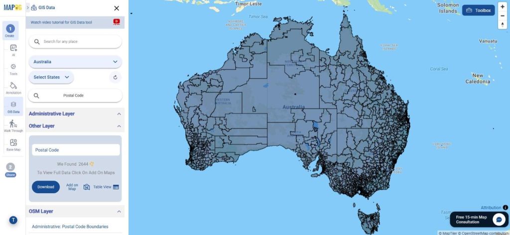
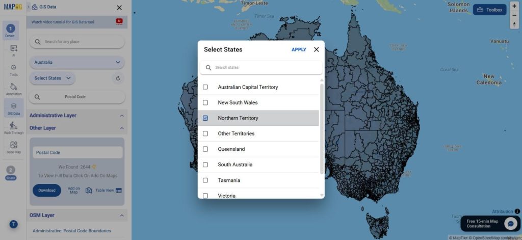
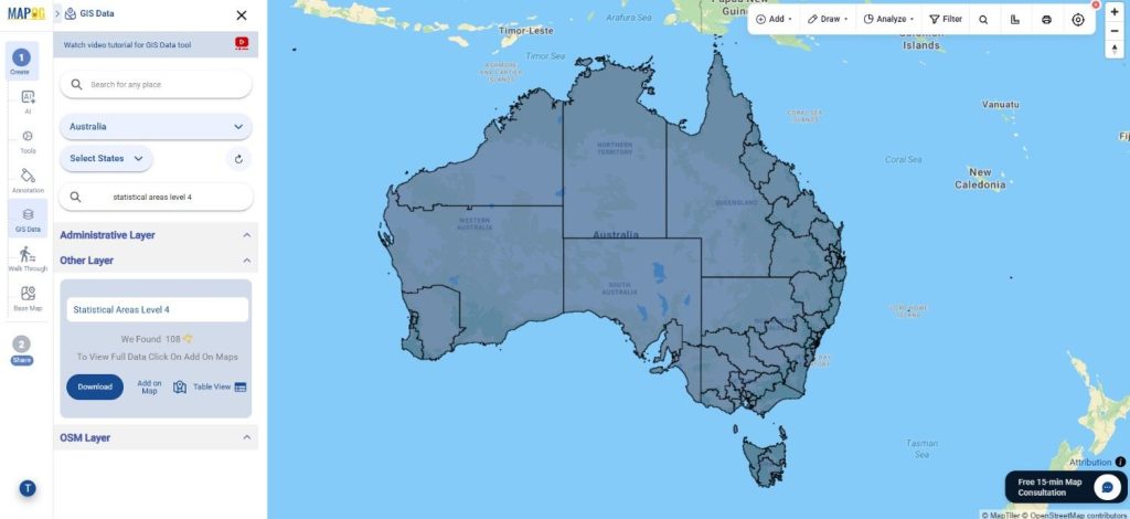
Begin by selecting GIS Data tool. Choose “Australia” in select country panel. Then, you can get the Statistical Areas Level 4 in other layer or use the search layer option to find “Statistical Areas Level 4.” Users can inspect layer attributes to understand whether the dataset contains polygon boundaries or other geographic elements before downloading.
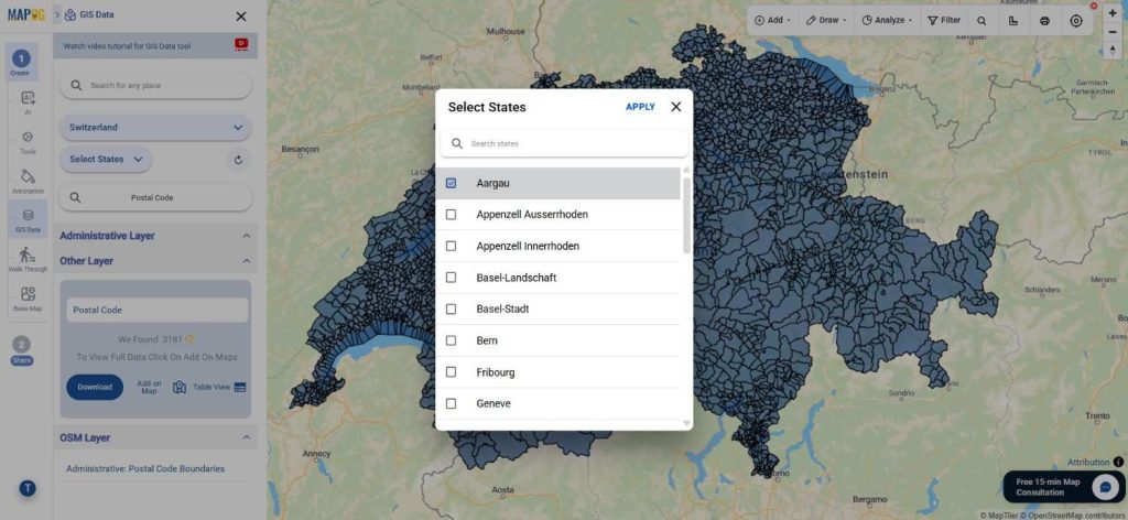
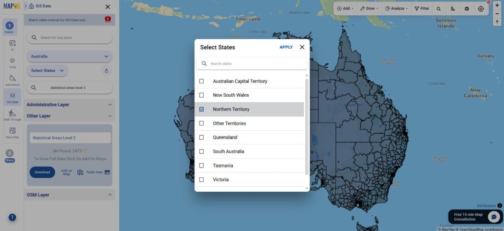
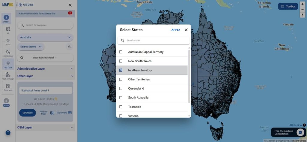
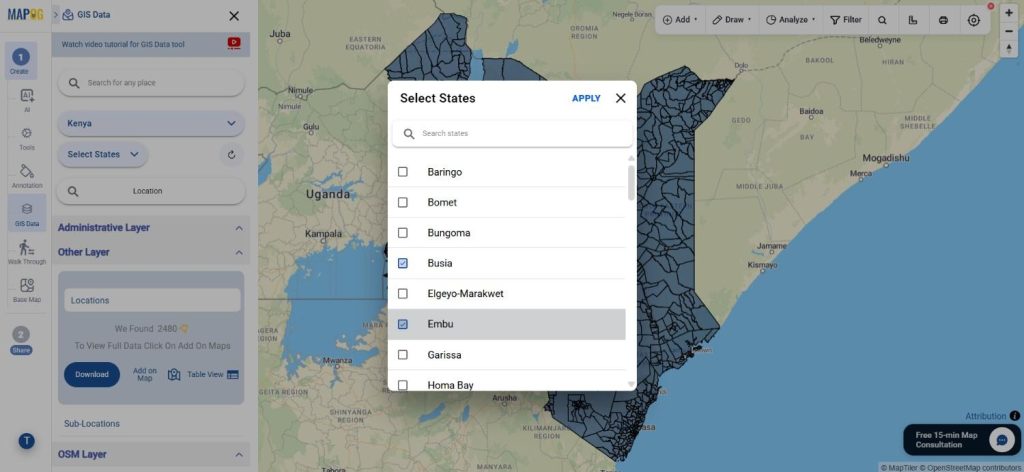
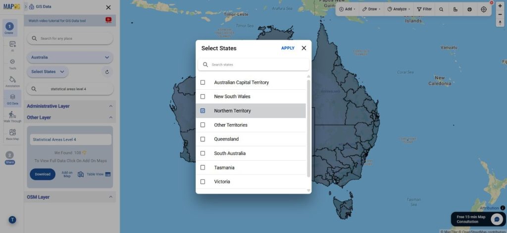
Step 2: Filter the Data
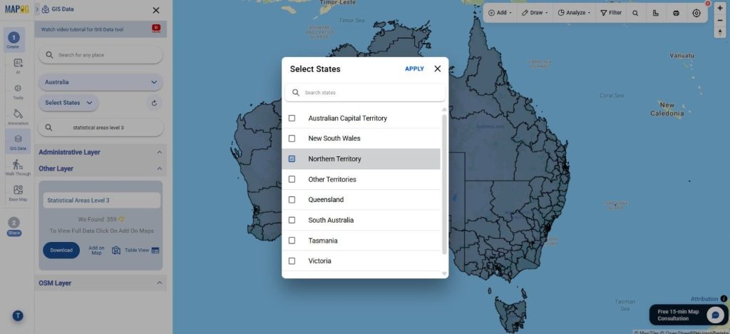
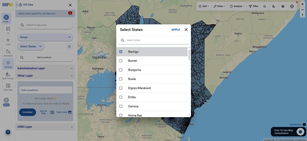
The Filter Data option helps users narrow down large datasets more effectively. Data can be filtered based on state, district, or regional divisions for more accurate analysis. If broader datasets are available, users can further refine the information to reach highly specific geographic areas.
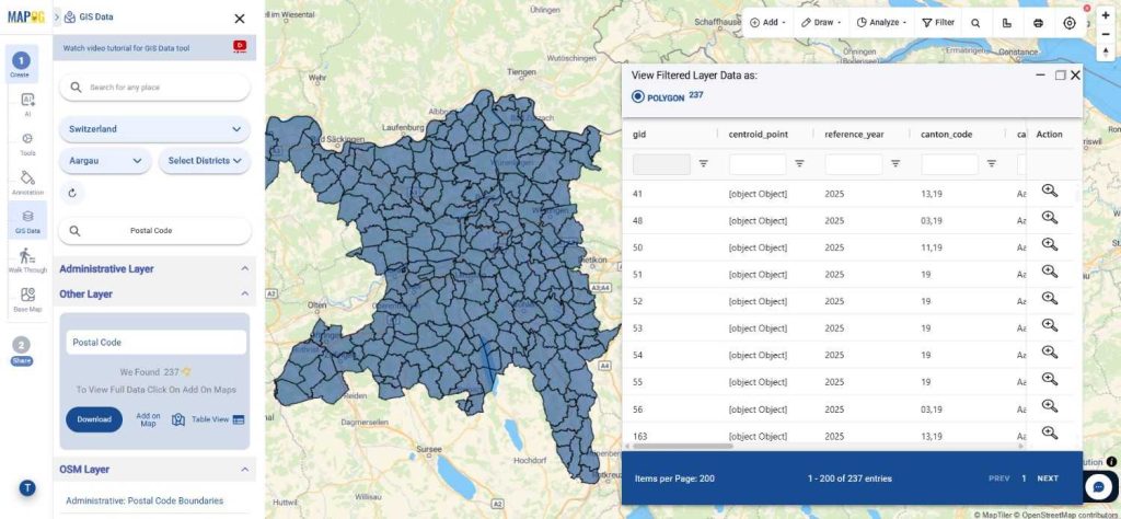
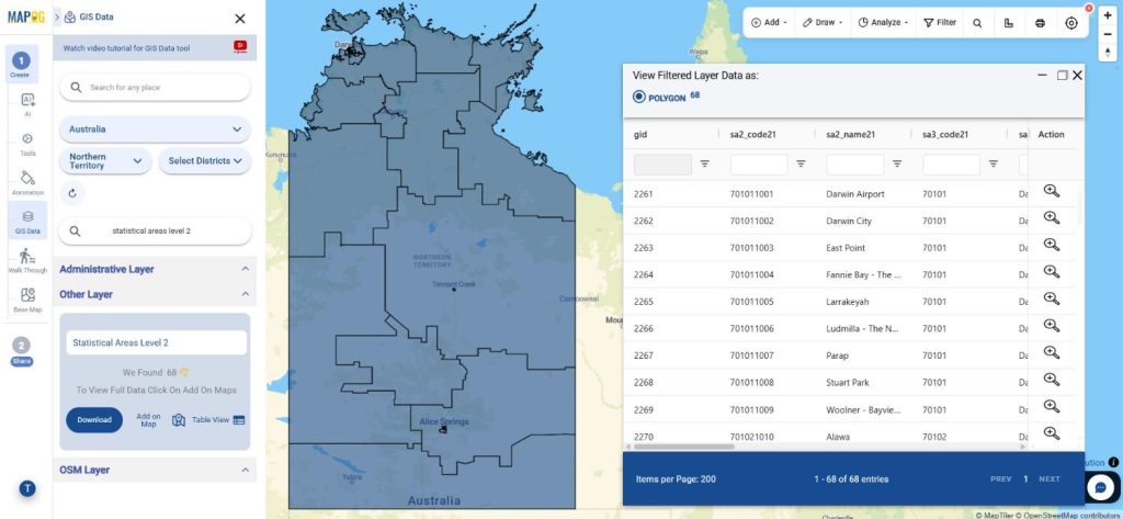
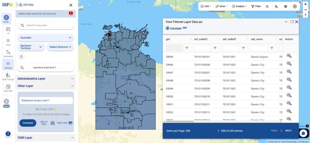
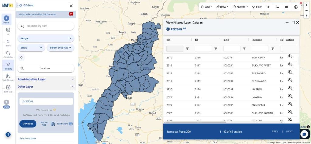
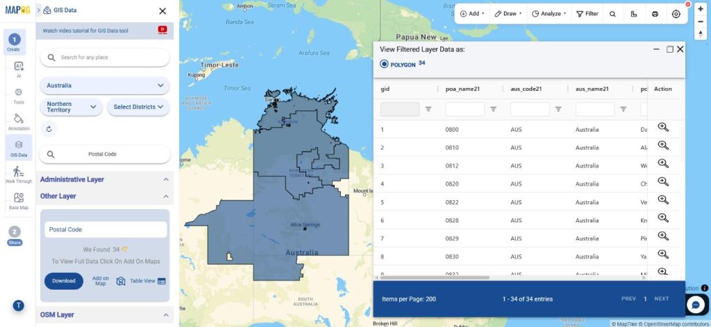
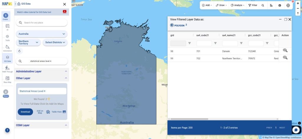
Step 3: Add Data on the Map
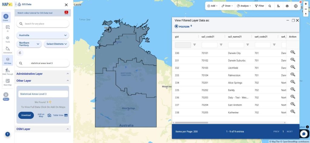
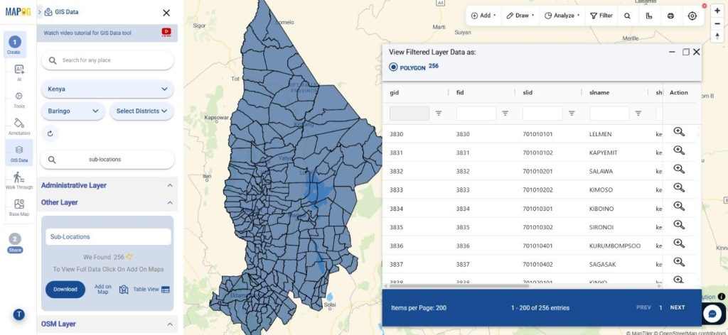
Using the “Add on Map” feature, selected layers can be directly visualized within the GIS analysis interface. This helps users analyze spatial patterns, compare nearby regions, and perform deeper geographic studies using interactive mapping tools.
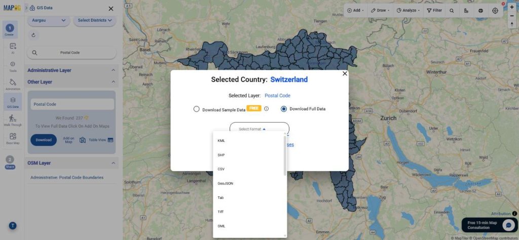
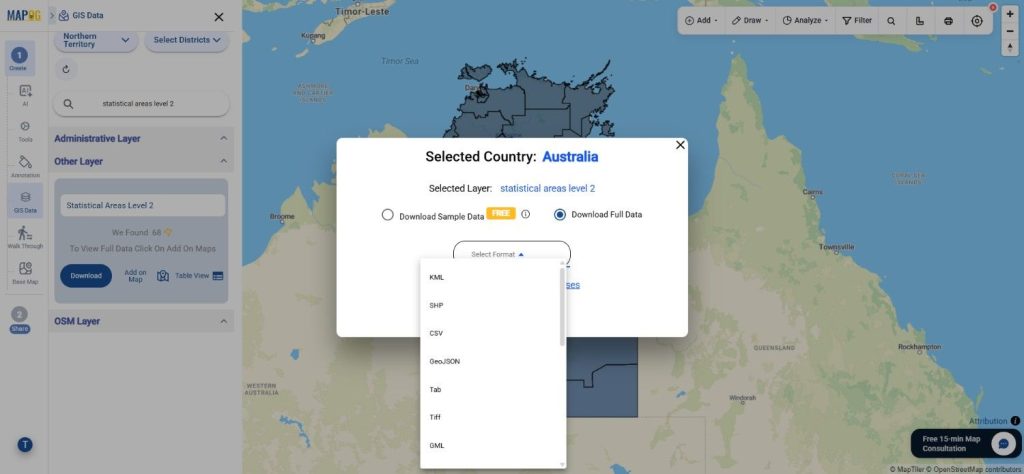
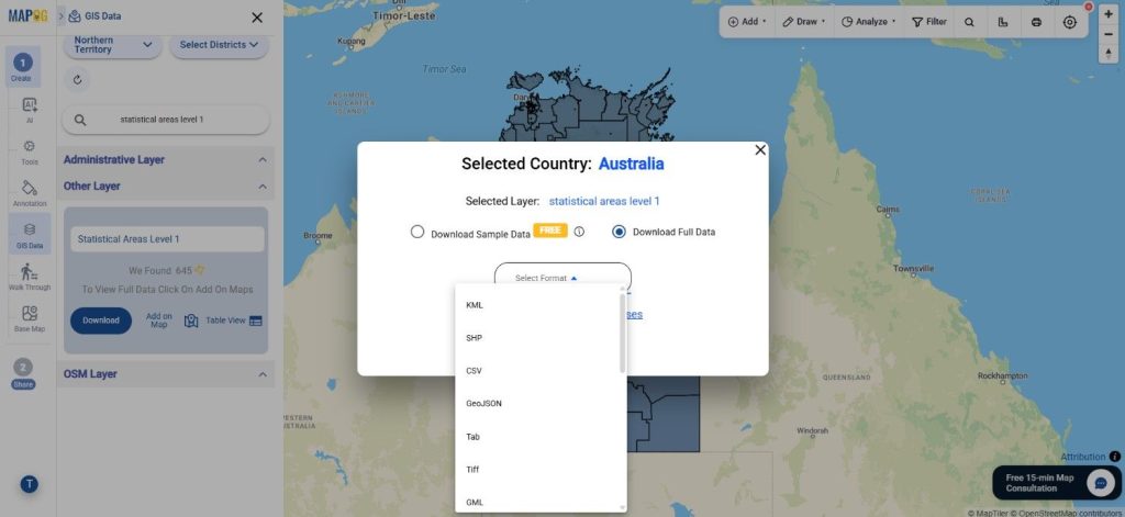
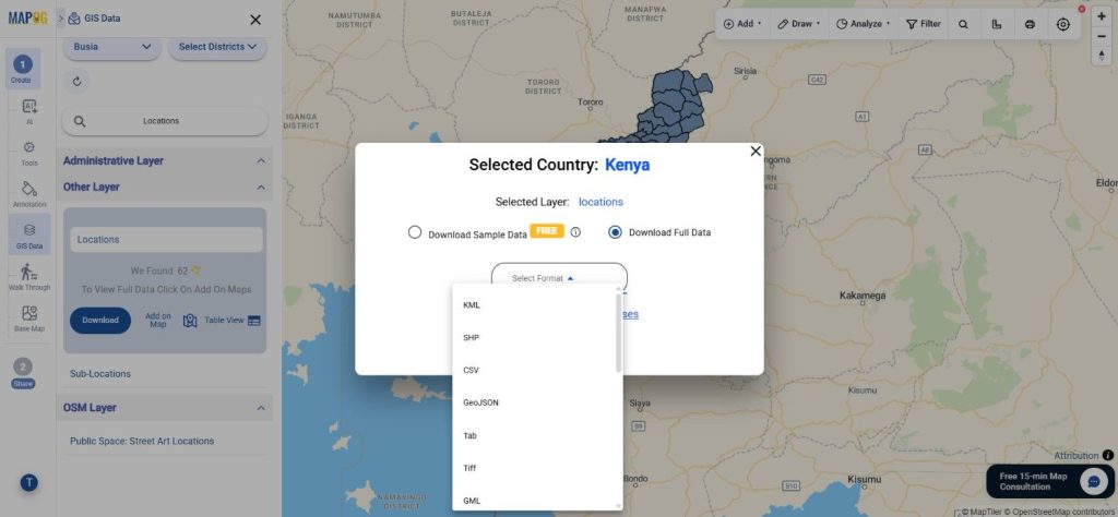
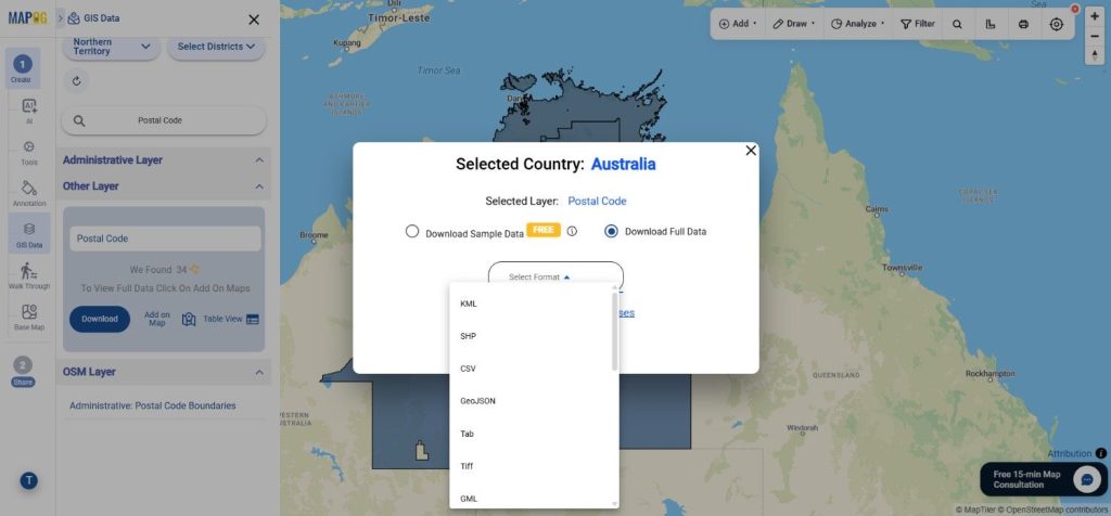
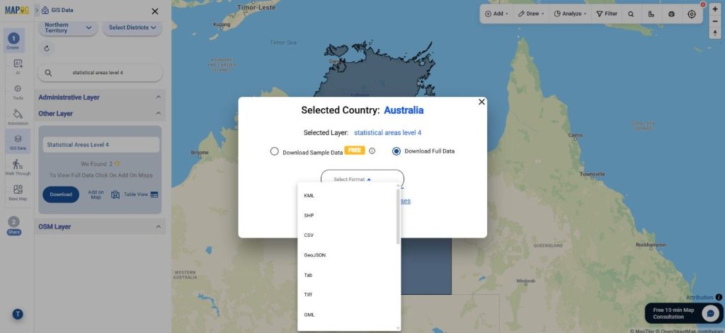
Step 4: Download the Dataset
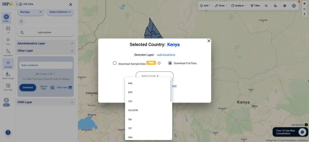
After reviewing the dataset, click on the “Download Data” option. Users may choose either sample data or the complete dataset based on project requirements. Select the required output format such as Shapefile, KML, MID, GeoJSON, or any of the additional supported GIS formats, then proceed with the download.
Final Thoughts
With GIS Data by MAPOG, Download Australia statistical areas level 4 datasets quickly and efficiently for mapping, planning, and analytical projects. The platform combines flexible export options, AI-powered search, filtering tools, and interactive visualization features to simplify GIS workflows. Whether the requirement involves research, statistical reporting, infrastructure planning, or spatial analysis, Australia statistical areas level 4 Data can be accessed and managed smoothly through MAPOG’s GIS ecosystem.
Download More Useful Data from Australia:
- Tourism Regions
- Electoral Divisions (SED)
- Commonwealth Electoral Divisions (CED)
- Postal Code
- Statistical Areas Level 1
- Statistical Areas Level 2
- Statistical Areas Level 3
Download Shapefile for the following:
- World Countries Shapefile
- Australia
- Argentina
- Austria
- Belgium
- Brazil
- Canada
- Denmark
- Fiji
- Finland
- Germany
- Greece
- India
- Indonesia
- Ireland
- Italy
- Japan
- Kenya
- Lebanon
- Madagascar
- Malaysia
- Mexico
- Mongolia
- Netherlands
- New Zealand
- Nigeria
- Papua New Guinea
- Philippines
- Poland
- Russia
- Singapore
- South Africa
- South Korea
- Spain
- Switzerland
- Tunisia
- United Kingdom Shapefile
- United States of America
- Vietnam
- Croatia
- Chile
- Norway
- Maldives
- Bhutan
- Colombia
- Libya
- Comoros
- Hungary
- Laos
- Estonia
- Iraq
- Portugal
- Azerbaijan
- Macedonia
- Romania
- Peru
- Marshall Islands
- Slovenia
- Nauru
- Guatemala
- El Salvador
- Afghanistan
- Cyprus
- Syria
- Slovakia
- Luxembourg
- Jordan
- Armenia
- Haiti And Dominican Republic
- Malta
- Djibouti
- East Timor
- Micronesia
- Morocco
- Liberia
- Kosovo
- Isle Of Man
- Paraguay
- Tokelau
- Palau
- Ile De Clipperton
- Mauritius
- Equatorial Guinea
- Tonga
- Myanmar
- Thailand
- New Caledonia
- Niger
- Nicaragua
- Pakistan
- Nepal
- Seychelles
- Democratic Republic of the Congo
- China
- Kenya
- Kyrgyzstan
- Bosnia Herzegovina
- Burkina Faso
- Canary Island
- Togo
- Israel And Palestine
- Algeria
- Suriname
- Angola
- Cape Verde
- Liechtenstein
- Taiwan
- Turkmenistan
- Tuvalu
- Ivory Coast
- Moldova
- Somalia
- Belize
- Swaziland
- Solomon Islands
- North Korea
- Sao Tome And Principe
- Guyana
- Serbia
- Senegal And Gambia
- Faroe Islands
- Guernsey Jersey
- Monaco
- Tajikistan
- Pitcairn
Disclaimer : The GIS data provided for download in this article was initially sourced from OpenStreetMap (OSM) and further modified to enhance its usability. Please note that the original data is licensed under the Open Database License (ODbL) by the OpenStreetMap contributors. While modifications have been made to improve the data, any use, redistribution, or modification of this data must comply with the ODbL license terms. For more information on the ODbL, please visit OpenStreetMap’s License Page.
Here are some blogs you might be interested in:
- Download Pharmacy Data in Shapefile, KML, GeoJSON, and More – Filter and Download
- Download ATM Data in Shapefile, KML, MID +15 GIS Formats Using GIS Data by MAPOG
- Download Road Data in Shapefile, KML, GeoJSON, and 15+ GIS Form
- Download Airport data in Shapefile, KML , MIf +15 GIS format – Filter and download
- Download Bank Data in Shapefile, KML, GeoJSON, and More – Filter and Download
- Download Railway data in Shapefile, KML, GeojSON +15 GIS format
- Download Farmland Data in Shapefile, KML, GeoJSON, and More – Filter and Download