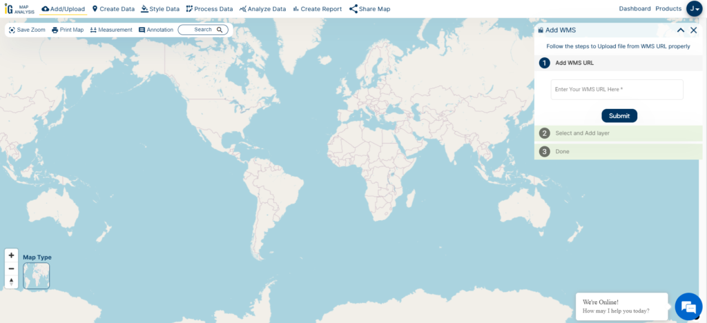
Looking to Download Racetrack Data for mapping or analysis? GIS Data by MAPOG offers a smooth and structured way to access racetrack location datasets in over 15 GIS-compatible formats, including Shapefile, KML, GeoJSON, and MID. Whether you’re exploring racetrack infrastructure for sports planning, tourism, or transportation studies, this intuitive platform delivers well-organized, up-to-date spatial data tailored to your needs.
How to Download Racetrack Data
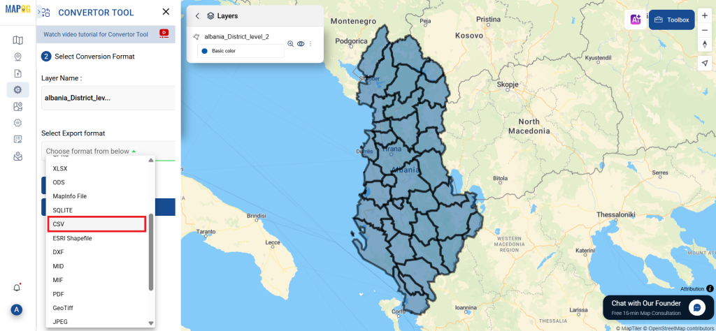
GIS Data by MAPOG simplifies complex GIS tasks by providing access to more than 900+ layers of data from across the globe. From racing circuits in metropolitan areas to more remote track locations, users can Download Racetrack Data in formats like SHP, KML, CSV, MID, DXF, SQL, TOPOJSON, and more. This wide variety ensures compatibility with all leading GIS software.
Download Racetrack Data of any countries
Note:
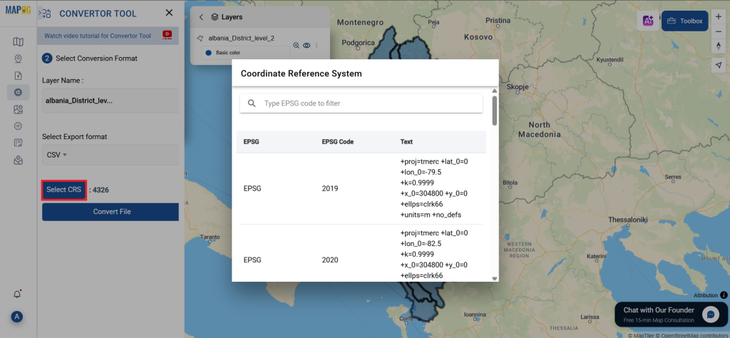
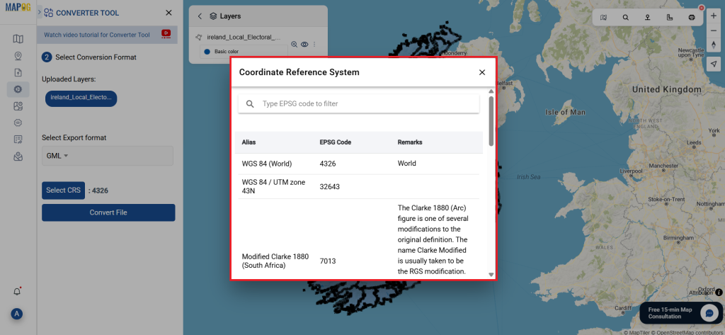
- All data is provided in GCS datum EPSG:4326 WGS84 CRS (Coordinate Reference System).
- Users need to log in to access and download their preferred data formats.
Step-by-Step Guide to Access and Download Racetrack Data
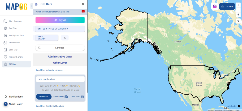
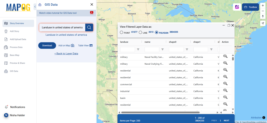
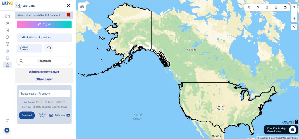
Step 1: Search for Racetrack Data
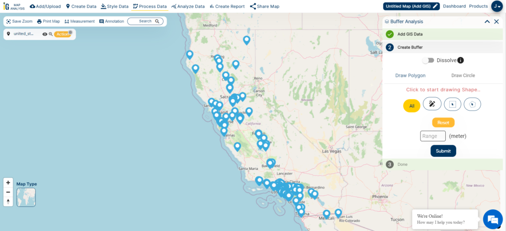
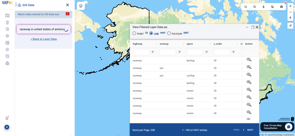
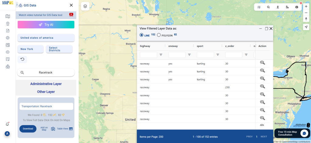
Begin by selecting the relevant area or country on the MAPOG interface. Then, search for “Racetrack Data” using the search layer tool. Check whether the layer is point-based (for individual tracks) or polygon-based (for track boundaries).

Step 2: Try the AI Search Tool
Use the built-in “Try AI” option for smarter and faster data lookup. Simply type keywords like “Racetracks nearby” or “Racing circuits,” and the tool will pull accurate layers for you—saving both time and effort.

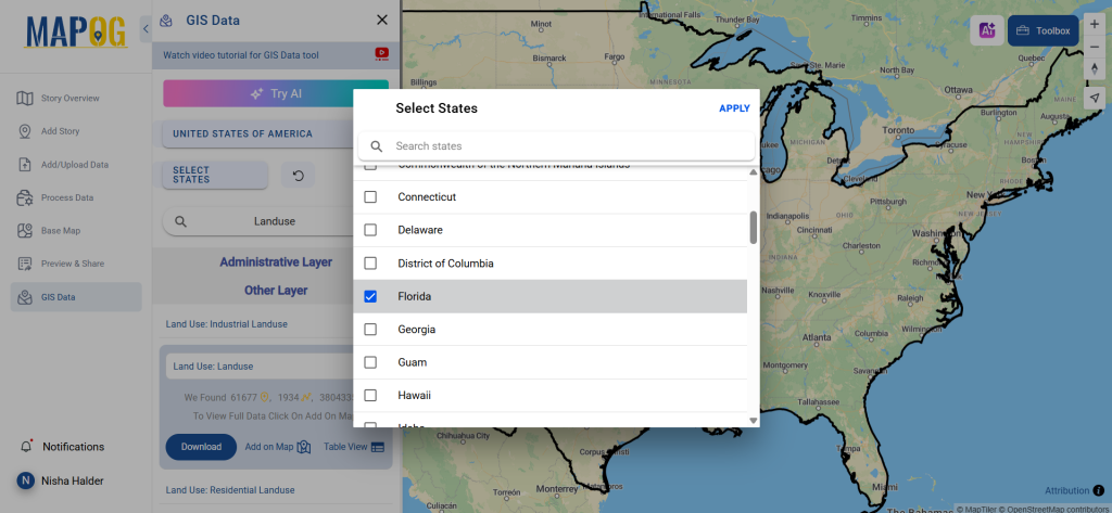
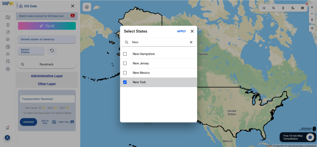
Step 3: Refine with Data Filters
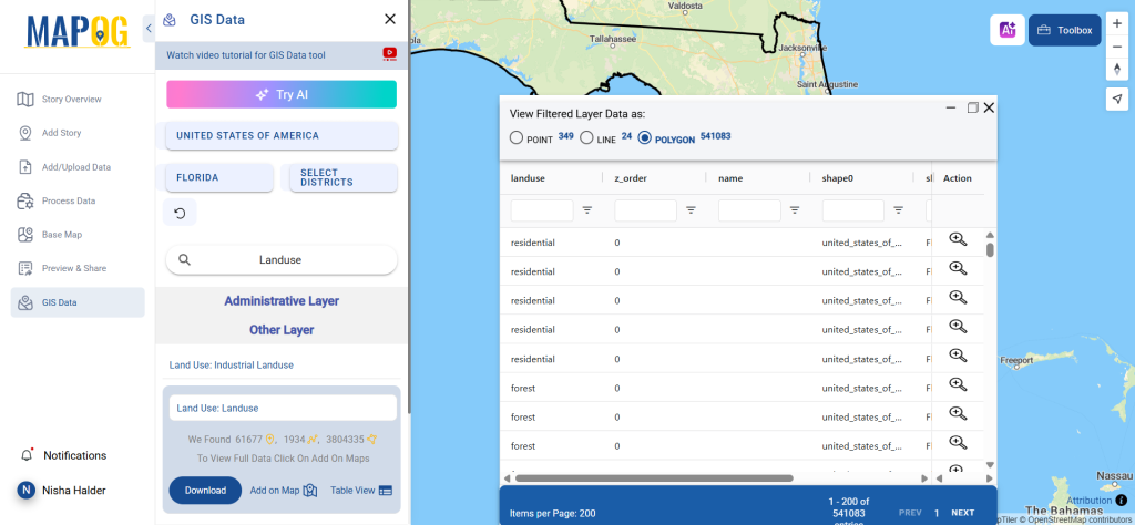
Looking for tracks in a specific region? The Filter Data option allows you to narrow down your search by state or district. This is especially helpful when your analysis focuses on specific administrative zones or local planning.
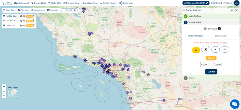
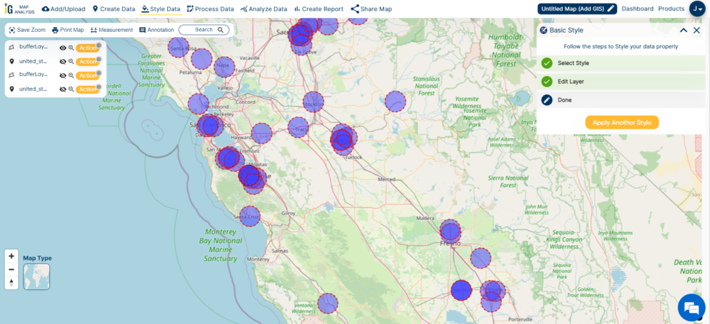
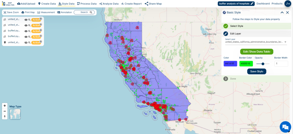
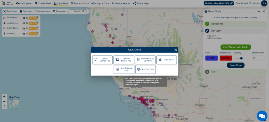
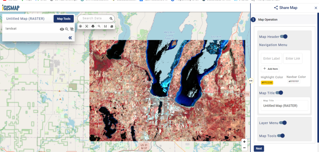
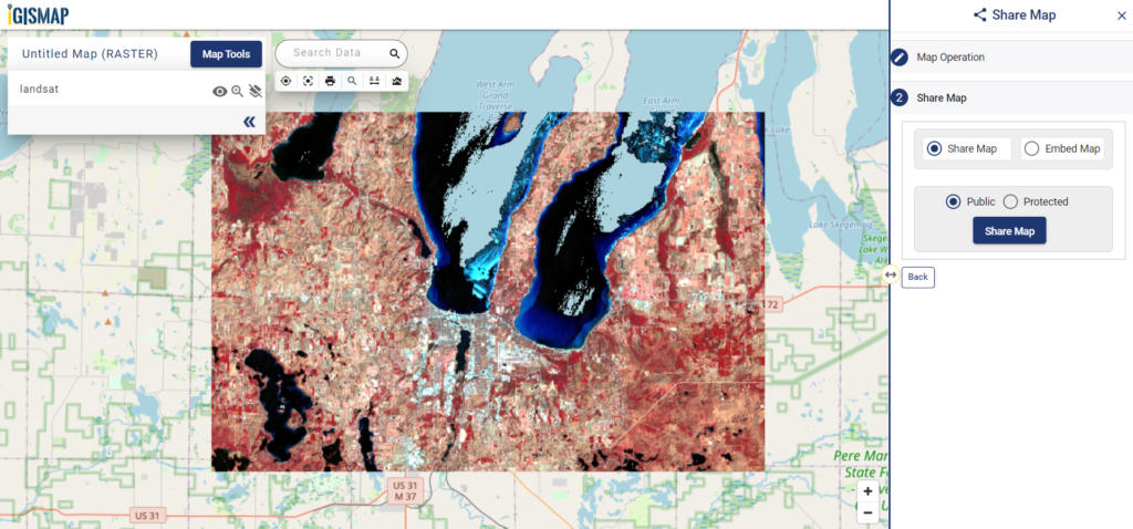
Step 4: Visualize Using ‘Add on Map’
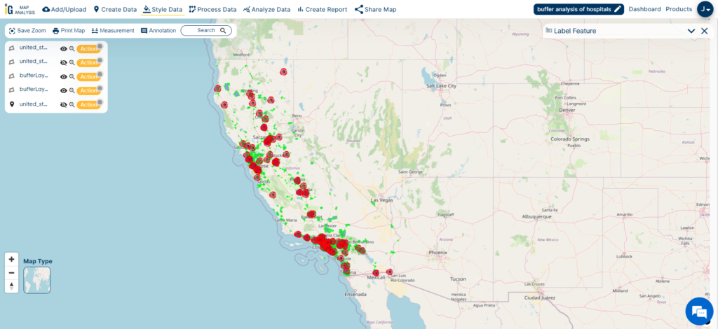
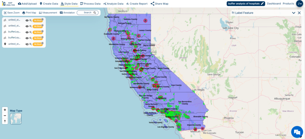
Once you find a relevant dataset, click on “Add on Map” to load it onto MAPOG’s interactive GIS viewer. This visualization helps users analyze track distributions, urban proximity, and regional access patterns—all in one place.
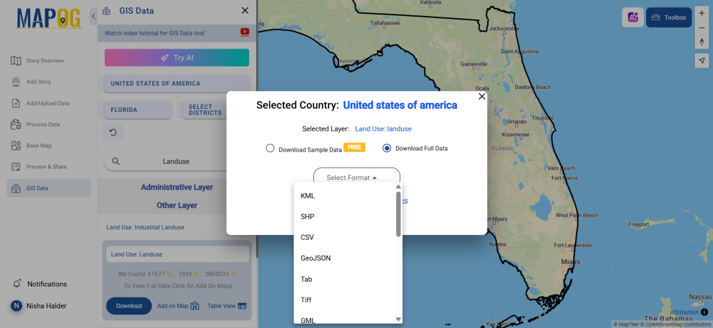
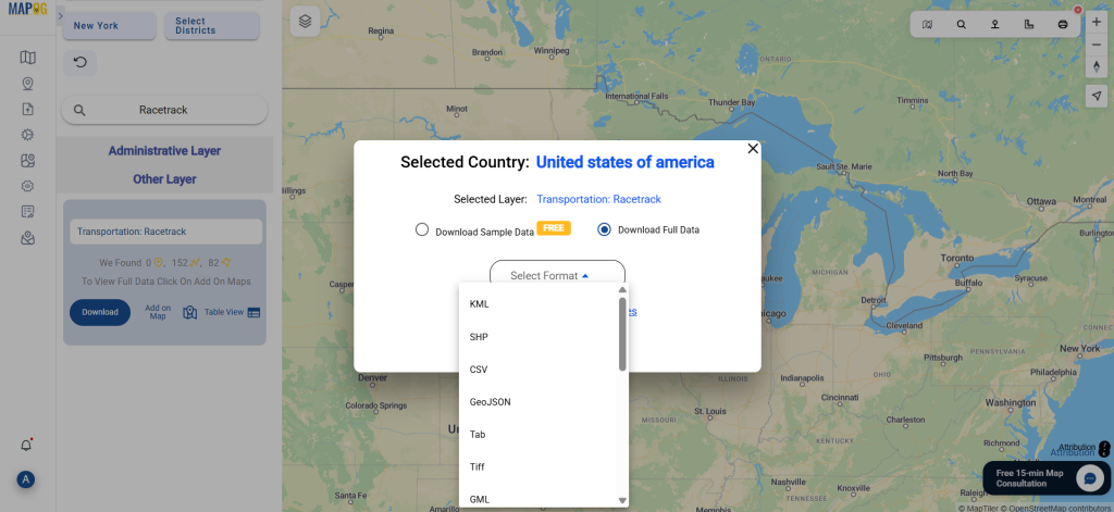
Step 5: Download the Dataset
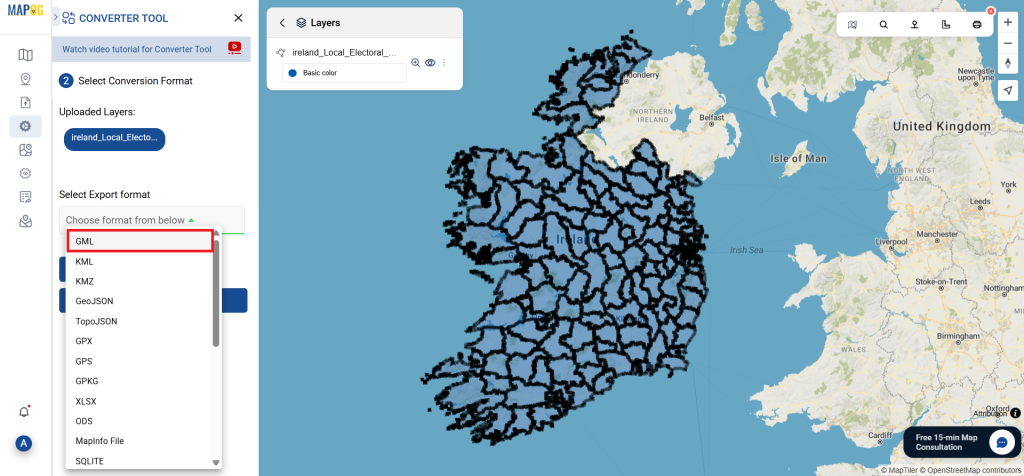
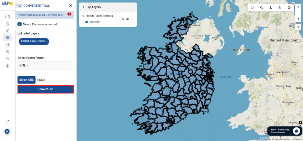
After reviewing the data visually, proceed to download. Choose from sample or full datasets. Then, select your preferred GIS format—whether Shapefile, MID, KML, or another supported type. Accept the terms and click the final download button.

Final Thoughts
With MAPOG’s powerful tools, the ability to Download Racetrack Data becomes both simple and efficient. This platform is designed to support a variety of GIS users—whether you’re a researcher, a sports analyst, or someone building a custom map for planning or tourism. With comprehensive coverage and multi-format support, MAPOG equips you with everything needed to work smarter with racetrack geography.
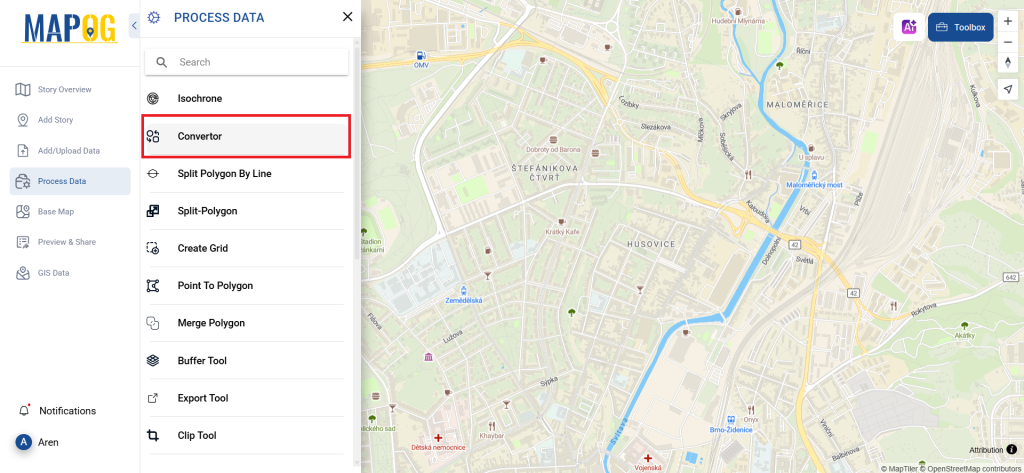
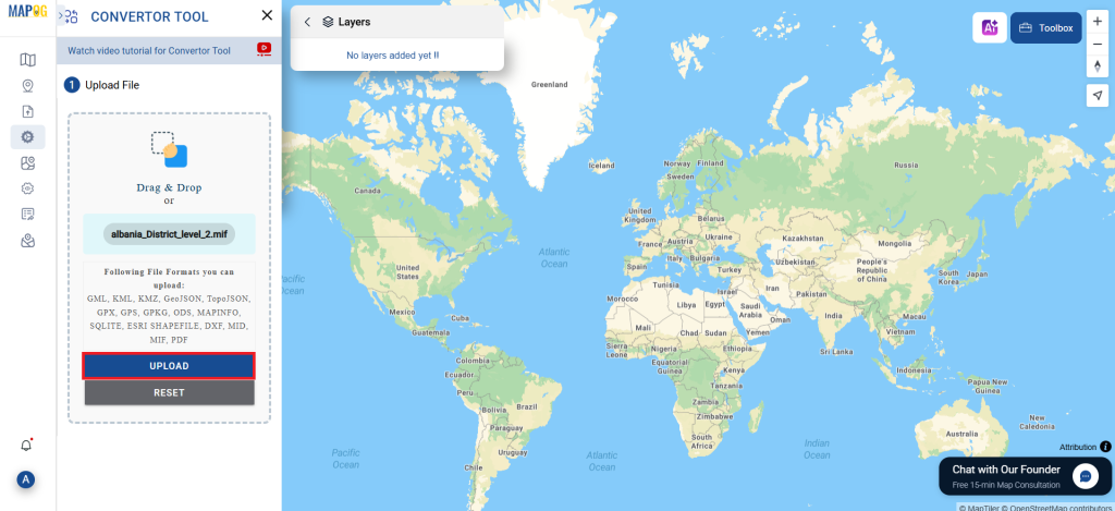
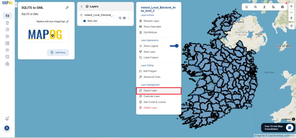
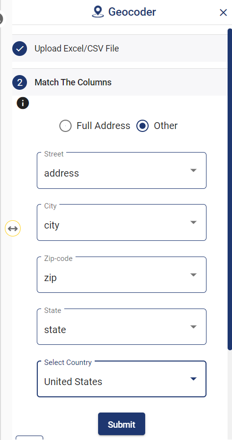
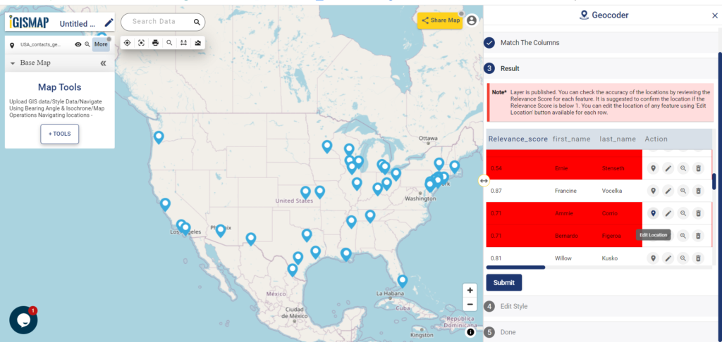
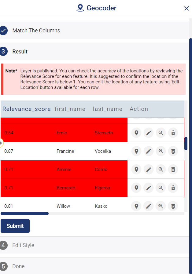
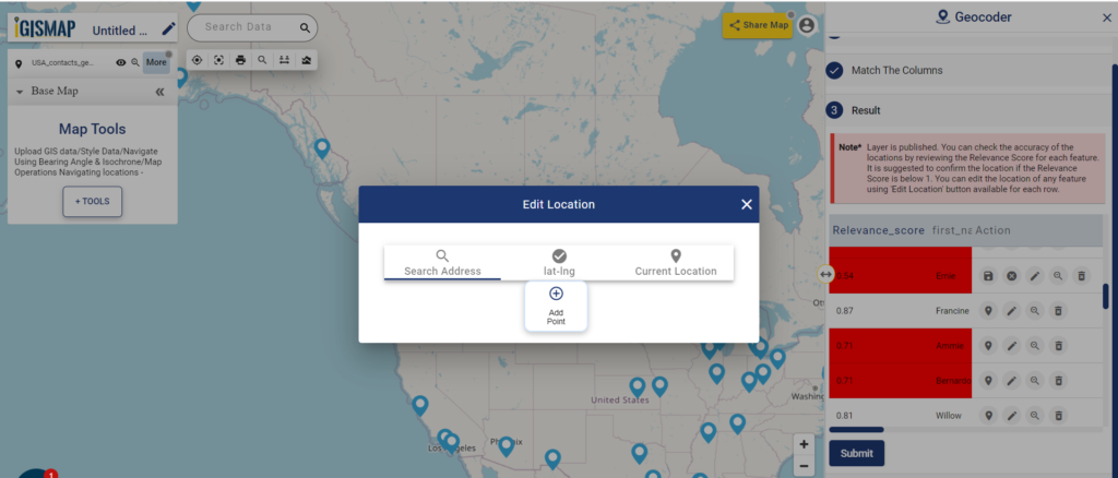
With MAPOG’s versatile toolkit, you can effortlessly upload vector and upload Excel or CSV data, incorporate existing layers, perform polyline splitting, use the converter for various formats, calculate isochrones, and utilize the Export Tool.
For any questions or further assistance, feel free to reach out to us at support@mapog.com. We’re here to help you make the most of your GIS data.
Download Shapefile for the following:
- World Countries Shapefile
- Australia
- Argentina
- Austria
- Belgium
- Brazil
- Canada
- Denmark
- Fiji
- Finland
- Germany
- Greece
- India
- Indonesia
- Ireland
- Italy
- Japan
- Kenya
- Lebanon
- Madagascar
- Malaysia
- Mexico
- Mongolia
- Netherlands
- New Zealand
- Nigeria
- Papua New Guinea
- Philippines
- Poland
- Russia
- Singapore
- South Africa
- South Korea
- Spain
- Switzerland
- Tunisia
- United Kingdom Shapefile
- United States of America
- Vietnam
- Croatia
- Chile
- Norway
- Maldives
- Bhutan
- Colombia
- Libya
- Comoros
- Hungary
- Laos
- Estonia
- Iraq
- Portugal
- Azerbaijan
- Macedonia
- Romania
- Peru
- Marshall Islands
- Slovenia
- Nauru
- Guatemala
- El Salvador
- Afghanistan
- Cyprus
- Syria
- Slovakia
- Luxembourg
- Jordan
- Armenia
- Haiti And Dominican Republic
- Malta
- Djibouti
- East Timor
- Micronesia
- Morocco
- Liberia
- Kosovo
- Isle Of Man
- Paraguay
- Tokelau
- Palau
- Ile De Clipperton
- Mauritius
- Equatorial Guinea
- Tonga
- Myanmar
- Thailand
- New Caledonia
- Niger
- Nicaragua
- Pakistan
- Nepal
- Seychelles
- Democratic Republic of the Congo
- China
- Kenya
- Kyrgyzstan
- Bosnia Herzegovina
- Burkina Faso
- Canary Island
- Togo
- Israel And Palestine
- Algeria
- Suriname
- Angola
- Cape Verde
- Liechtenstein
- Taiwan
- Turkmenistan
- Tuvalu
- Ivory Coast
- Moldova
- Somalia
- Belize
- Swaziland
- Solomon Islands
- North Korea
- Sao Tome And Principe
- Guyana
- Serbia
- Senegal And Gambia
- Faroe Islands
- Guernsey Jersey
- Monaco
- Tajikistan
- Pitcairn
Disclaimer : The GIS data provided for download in this article was initially sourced from OpenStreetMap (OSM) and further modified to enhance its usability. Please note that the original data is licensed under the Open Database License (ODbL) by the OpenStreetMap contributors. While modifications have been made to improve the data, any use, redistribution, or modification of this data must comply with the ODbL license terms. For more information on the ODbL, please visit OpenStreetMap’s License Page.
Here are some blogs you might be interested in:
- Download Airport data in Shapefile, KML , MIf +15 GIS format – Filter and download
- Download Bank Data in Shapefile, KML, GeoJSON, and More – Filter and Download
- Download Railway data in Shapefile, KML, GeojSON +15 GIS format
- Download Farmland Data in Shapefile, KML, GeoJSON, and More – Filter and Download
- Download Pharmacy Data in Shapefile, KML, GeoJSON, and More – Filter and Download
- Download ATM Data in Shapefile, KML, MID +15 GIS Formats Using GIS Data by MAPOG
- Download Road Data in Shapefile, KML, GeoJSON, and 15+ GIS Form