Convert KML to GML Online

Convert KML to GML effortlessly with MAPOG. Streamline your geographic data transformation for enhanced spatial analysis and interoperability.

Transforming your GIS data by converting KML to GML can make it easier to analyze, share, and integrate into various GIS applications. In this guide, we’ll walk you through the process of efficiently converting your KML files to GML using the powerful Converter Tool in MAPOG Map Analysis. Whether you’re a beginner or an experienced user, this tutorial will help you understand the process in easy steps.

Converting KML to GML with MAPOG

Key Concept of Converting Files

The Converter Tool in MAPOG Map Analysis helps you change your data from one format to another effortlessly. You input your data in one form, and it transforms it into another form that you need for your analysis. This versatility allows you to download and use data in various formats, making it adaptable for different applications.

Steps to Convert KML to GML GIS Data File

Step 1: Upload the Data

Access the Converter Tool: Click on the “Process Data” menu and choose the “Converter Tool” option.

Access the Converter Tool

Upload Your KML File: This is your starting point where you provide the data that needs conversion.

Upload Your KML File

Step 2: Select the Format for Conversion

Choose the Output File Format: Select GML as the output file format. The tool offers various formats, but for this guide, we focus on converting to GML.

Choose the Output File Format

Set the CRS (Coordinate Reference System): You can also set the CRS at this stage to ensure your data aligns correctly with your spatial analysis requirements.

Set the CRS (Coordinate Reference System)

Step 3: Run the Conversion

Start the Conversion Process: Click ‘Convert’ and let the tool work its magic. The Converter Tool processes your data, transforming it from KML to GML format.

Start the Conversion Process

Step 4: Review and Download

Review the Converted Data: Check your converted GML data to ensure it looks right. This step is crucial to verify that the conversion has been successful and the data integrity is maintained.

Review the Converted Data

Download the Converted File: Once satisfied, download the converted file.

And there you have it! You’ve successfully used the Converter Tool in MAPOG Map Analysis to convert your KML files to GML. Now you can easily convert your data for all your analysis needs, simplifying the process of handling different data formats and making your workflow more efficient and effective. For any queries, please contact us at support@mapog.com.

Here are some other blogs you might be interested in:

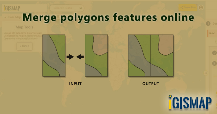
Merge polygons features online using IGISMap

In GIS data, a geographic area is represented in a polygon shape. Geospatial features such as administrative boundaries are digitized in the polygon vector model. In some cases, we need to merge the polygon features based on attribute values or location. After merging, input polygons will merge into a single polygon feature assigned with a single row to store attribute values. When the adjacent polygons with common border lines are merged, they combine to form a single polygon. Through merge functionality, we can create any primary-level administrative boundaries like national boundaries from the secondary level divisions like state or district level boundaries. So here in this article, we are providing steps to merge polygons features online in a single layer.

Merging is a common geoprocessing used in GIS projects for two important cases. One is to merge multiple GIS features into single GIS feature within a GIS data itself. Another application is to merge multiple GIS data into single GIS data. In both cases, geometry entity of the input GIS feature or GIS data should be same ie., either point, polyline or polygon.

IGISMap provides Merge Polygons tool to merge multiple polygon features of a polygon GIS data into single polygon feature. IGISMap is a GIS-based web platform, that provides multiple GIS applications that are most important in the field of geospatial analytics. The peculiarity of IGISMAP in the GIS Industry is its user interface which helps the user to perform effortless geospatial operations. Merge Polygons tool is very easy to use and you can merge the required polgons in just two steps.

In this article we will create the national boundary of USA by merging the polygons of state boundaries. Without further due, lets dive into Merge Polygons tool.

Click https://map.igismap.com/merge-polygon to open Merge Polygons tool.

Add your data

After opening Merge Polygons tool, first step is to add or upload polygon GIS data. Here we will choose Upload Data option to upload the data from your personal computer. Then, click on the Browse button to open the browsing box, where you will choose the file from your pc. In this article, we will be uploading a polygon GIS data of USA state level boundaries.

Upload Data

After opening the file, click the Upload button to start the upload process.

Uploading GIS data

Check the article Add / Upload polygon GIS data and merge required polygon features to understand how to use IGISMap GIS data in Merge Polygons tool.

Select polygons using Lasso Tool

When uploading is complete, polygon GIS data of USA state level boundaries will be published in the map. This data will be selected as the input data for carying out the merge operation.

Select Lasso Tool

You can access this same data from IGISMap GIS Data collection through Add GIS Data option provided in the Data Selection section.

Click https://map.igismap.com/add-gis to access Add GIS Data tool directly

Click below to download polygon GIS data of USA state level boundaries

Download USA State Level Boundaries Shapefile

Next step is to select the required polygon features from the input polygon data. IGISMap provides two options to select the polygons. They are – Lasso Tool and Select Manually. Lasso Tool option is suitable to selecte large number of polygon features, hence we will select Lasso Tool tab.

Lasso Tool will open the list of modes to draw a polygon over the required polygon features. These are Draw Polygon With Free Hand, Draw Circle, Draw Rectangle, and Draw Polygon. Select Draw Polygon and draw a polygon intersecting all the polygons of the states.

Draw Polygon using the Lasso Tool

Polygon features of the input polygon GIS data that intersected by the lasso polygon will be selected for merging. Then click Submit to start merging.

Polygons selected using Lasso tool

Output polygon

After submitting, merged polygon GIS data of USA national ouline boundary is published in the map, as shown below

Merged Layer

In the above article we uploaded polygon GIS data and merge polygons features online. But if you have point data you can also convert it into polygon by point to polygon conversion feature of IGISMap Tool. This is good if you have point data. If you don’t have data you can Create Point Data using our tool.

Check the article Share your Map to understand the Share Map feature of IGISMap.

Check other articles:
Check the following IGISMap tools:

Convert addresses from spreadsheet to points on Map in two steps

Consider a customer service manager working for a supermarket company wants to connect with some of their best customers for giving winning prizes and to promote their business. The manager has a list of contacts along with their address which is located all over America. In order to deliver the winning prizes to their doorstep, he has to find the best route which takes a minimum number of days to receive it. Hence he has to give the delivery partner the best route which is easier and less time-consuming.

In such cases, Geocoding helps to make the process easier. Geocoding is the process of converting one or more valid address with location details into GIS points.Geocoder tool of IGISMap can be used for converting address details to point GIS data in a few steps. You only need to upload the spreadsheet file with address columns and assign the address columns to start plotting. Option to review the plotting and edit the points are also available in this tool.

IGISMap is a GIS-based web platform, that provides multiple GIS applications that are most important in the field of geospatial analytics. The peculiarity of IGISMap in the GIS Industry is its UI/UX, which helps the user to perform effortless geospatial operations. IGISMap allows users to edit the data table of vector data by editing the name of the columns, deleting the columns, and adding new columns. The Geocoder tool on the IGISMap increases efficiency by enabling different companies to better coordinate their sales in both domestic and foreign marketing activities.

Open Geocoder tool using the following link https://map.igismap.com/geocoder

Upload spreadsheet file

For uploading the input file, click on the Browse option, select the excel/CSV file from your system that you want to visualize on IGISMap, and click on the Upload option.

Upload Excel/CSV file

Match the Columns

After successfully uploading the file, the next step is to assign the address columns in your file to be used for geocoding. There are 2 options to match the columns – Full Address and Other. Full Address option is used for files with address information provided in a single column. In our case, we have address distributed in several columns, thus we will choose Other option. Click Other option and select the right address columns from you file at the right address types such as address, city, zip, state. Then select the country and click Submit button to geocode the address.

Match The Columns

Review the geocoded locations

A GIS layer gets published after submitting, with point locations based on the address information from the input spreadsheet file. Result section also opens with datatable and Relevance_score column.

Geocoder Result

Relevance_score is a value ranging between 0 to 10 provided for every row depicting the accuracy of the plotted locations after the geocoding each address, where 10 being the highest accuracy. User can check the relevance score for each row and edit the point location if needed. Rows of the point features will be highlighted in red color if the relevance score is below 8. This is to notify the user to confirm the location plotted.

Relevance Score

How to edit location by checking relevance score

The user can delete any feature by using the Delete Feature button present on the Relevance_score table. Click Edit Attribute button of any required feature to start editing the attribute values of that feature and then click Save icon.

The user can edit the location of any point feature by using the Edit Location button. After clicking the Edit Location button in the row of any point feature, a pop-up menu with the options to edit the location.

Edit Location
  1. Search Address – Enter an appropriate address to replace the pin to that location
  2. lat-lng – Enter latitude/longitude values to replace the pin to that coordinate
  3. Current Location – To replace the pin to your current location
  4. Add Point – Manually plot a point on the base map

Now click Submit button to save the changes in the point GIS data

User can further edit the style of the points or share the map publicly or privately

How to style your polygon GIS data categorically

GIS helps users to understand patterns, relationships and geographic context. It benefit includes improved communication and efficiency, as well as improved management and decision-making. GIS combines datasets with maps, integrated regional datasets with any type of descriptive information or data. It provides mapping and assessment prerequisites for technology and almost every industry.

Visualization and intepretaion of data is what makes GIS a beautiful and interesting fields in data analytics. Science of visualization is the core essence in the art of cartography and mapping. Any type of geospatial features presented in the map with proper color combination, accurate size and location helps in better image interpretation. Quantity and category based representation of spatial features are the common visualization styles used in GIS.

IGISMap Styling Tools

IGISMap is a web platform providing multiple GIS applications that are most important in the field of geospatial analytics. The peculiarity of IGISMap in the GIS Industry is its UI/UX that helps the user to perform effortless geospatial operations. IGISMap provides the following styling tools:

Among the styling options listed above – Basic, Category and Quantity styling options are used to style polygon and points, whereas Bubble Style and Icon Style are used to symboloze point GIS data. Basic Style will give any single color for the while GIS layer. Quantity Style is used to visualize the GIS data quantitatively. And Category Style will style your GIS map with separate colors assigned to each category of features

In this article we will talk about Category Style tool of IGISMap and how it can be used to categorically visualize your polygon GIS data like the following.

USA County Boundaries Data Categorized Based On States

Add your GIS data

For the demonstration, let’s add county boundary polygon data of USA from IGISMap GIS data collection. For this let’s use Add GIS Data tool of IGISMap.

Click https://map.igismap.com/add-gis to open Upload Vector File tool.

After opening the Add GIS Data tool, in the Select Country section we will select United States of America. Then Search Layer section opens with the list of GIS data of USA, where we need to select ‘administrative county boundaries‘.

Add GIS Data

Before adding this data, lets check the data table of this data and verify the attribute field which we need to categorize this data. Switch the view from Map to Datatable and review the attribute fields. Here we are going to categorize the polygon features of county boundaries based on the state which it belongs to.

As you can see below, we have the attribute field for counties and the attribute field with states it belongs to.

Datatable in Add GIS Data

Since we have confirmed the data, lets continue downloading. First click the download icon beside the data name and then click the Add Layer button in the next section that opens.

Add Layer

Now the layer is published in the map with the name ‘united_states_administrative_county_boundaries

Data published from Add GIS Data

Click here – Download USA County Boundaries GIS Data

Open IGISMap Category Style tool

After adding the input GIS data from Add GIS Data, we can style the counties categorically using Category Style tool. For accessing the tool, click Tools button at the upper left side of screen to open the map tools popup. Then select Category Style tool listed under Style Your Data section.

Map Tools

We can also open the Category Style tool by going to the More option of input point data and choose the Category Style from the Edit Style option.

More options -Edit Style – Category Style

Styling GIS data categorically

Then the tool is appeared on the screen of IGISMap.

Category Style

Then the tool appears and we have to select the layer from Select Layer section which is the ‘united_states_administrative_county_boundaries‘ data that is published in this map and then we have to click Next option.

Select Layer

After clicking Next, in the Edit Layer section, we can change the style as we want. In this section we can can change Opacity and change the Border Width as required. Now in the Attribute field, select state field to categorize the counties based on its individual attributes values.

Edit Layer

After selecting the required attribute field, all individual values will be listed with different colors assigned for each category.

Select Attribute Field

We can change the color for each category by the color and choosing the right color. Then we have to click OK.

Assign color to each category

After changing all color of the attributes we have to click on Save Style for styling the map categorically.

Save the Style

Now as you can see the map is converted into categorical style and the output map is shown.

Polygon GIS data categorized

For better view and make your data more interactive in the map, go to More and enable Make Interactive option.

Make Interactable

Now as you see below, the USA county level boundaries GIS data is better visualized in state based categories and the map got more interactive.

Interactable Map

You can share your map with others in public or private mode. Article Share your Map will help you understand more about Share Map feature of IGISMap.

Other articles:
Check the following IGISMap tools:

How to style point GIS data categorically

GIS helps users to understand patterns, relationships and geographic context. It benefit includes improved communication and efficiency, as well as improved management and decision-making. GIS combines datasets with maps, integrated regional datasets with any type of descriptive information or data. It provides mapping and assessment prerequisites for technology and almost every industry.

Visualization and intepretaion of data is what makes GIS a beautiful and interesting fields in data analytics. Science of visualization is the core essence in the art of cartography and mapping. Any type of geospatial features presented in the map with proper color combination, accurate size and location helps in better image interpretation. Quantity and category based representation of spatial features are the common visualization styles used in GIS.

IGISMap Styling Tools

IGISMap is a web platform providing multiple GIS applications that are most important in the field of geospatial analytics. The peculiarity of IGISMap in the GIS Industry is its UI/UX that helps the user to perform effortless geospatial operations. IGISMap provides the following styling tools:

  • Basic Style
  • Category Style
  • Quantity Style
  • Bubble Style
  • Icon Style

Among the styling options listed above, Bubble Style and Icon Style are used to symboloze point GIS data, whereas Basic, Category and Quantity styling options are used to style polygon and polyline GIS data. Bubble Style is used to style the point GIS data quantitatively and Icon Style is used to style point GIS data with the icon or categorically by assigning separate icon for each categories.

In this article, we will talk about how to categorically represent point GIS data using Icon Style tool of IGISMap and will walk through the steps to style your data categorically like the following

Administrative Locations in London

Uploading the data

For the demonstration, we will upload the point GIS data of administrative buildings locations in London city and categorize it based on types. First lets upload this data using Upload Vector File tool of IGISMap.

Click https://map.igismap.com/upload-vector-files to open Upload Vector File tool.

After opening the Upload Vector File tool, here we can upload required the vector data in any of the following vector formats.

GML, KML, KMZ, GeoJSON, TopoJSON, GPX, GPS, GPKG, ODS, MAPINFO, SOLITE, ESRI SHAPEFILE DXF MID. MIF, PDF

Upload Vector File

In the Select Layer section we have to click on Browse and select the input file from the system, which is the GIS data of administrative building locations in Lonndon named as London_admins. After opening the file, click Upload.

Uploading the file

After uploading, input GIS data will be visible on the IGISMap screen, represented by default icon style as shown below.

Point GIS Data plotted on map

Open IGISMap Icon Style tool

After adding the input GIS data, we can style the points categorically using Icon Style tool. For accessing the tool, click Tools button at the upper left side of screen to open the map tools popup. Then select Icon Style tool listed under Style Your Data section.

Map Tools

We can also open the Icon Style tool by going to the More option of input point data and choose the Icon Style from the Edit Style option.

More options

Styling point GIS data categorically

After the tool appears, we have to select the layer from Select Layer section which is the London_admins data that is published in this map and then we have to click Next option.

Select Layer

Then the Edit Layer section is appeared. Here we have to choose Category Icon. Now in the Attribute field, select admin field to categorize the point data based on its individual attributes values. You can also assign a default icons size to applied for every icon style in the Set Market Size box.

Icon Style – Category Icon

In the Icon Overlap, you can change the option between True or False. Choose True if you want the icons to be overlapping when the map is zoomed out. Select False if you want to see every point icons any zoom extend of the map.

After selecting the required attribute field, all individual values will be listed with different icons assigned for each category, with default marker size. We can change the icons for each category by selecting the edit option and choosing the right icon from the list provided. We can also assign appropriate marker size for each category at Set Marker Size section.

Setting Icon and Marker Size

After editing we have to click on Save Style for styling the point data.

Save the Style after Edit Layer

Following all the process we get the desired output on the screen of IGISMap.

Point Map by Icon Style

Create point data and convert it into polygons

Voronoi polygon is an area representing the influence from a particular point location. A Voronoi polygon is actually a systematic way to divide spaces into a number of regions using a set of input points. For each point there will be a corresponding area that consists of the locations closer to that point than any other. These areas are called Voronoi cells.

IGISMap provides a Point to Polygon tool to create Voronoi polygons out of point from input point data. IGISMap is a web platform providing multiple GIS applications that are most important in the field of geospatial analytics. In IGISMap, you can upload your GIS data and perform geospatial analysis.

In IGISMap, Point To Polygon tool will convert input point data into polygon data by creating a polygon shape for each point in the input point data, like the following.

Voronoi Polygon

Let’s look into the steps to use Point to Polygon tool of IGISMap.

Click https://map.igismap.com/point-to-polygon to open Point to Polygon tool directly

Point to polygon

After opening Point to Polygon tool, first step is to add the data using any of the following options:

  • Select
  • Create Points
  • Upload Vector
  • Upload CSV/Excel
  • Add GIS Data
Point to Polygon

Here we are going to choose the option to Create Points and then convert the point to polygons through voronoi conversion. Thus lets first create and publish point GIS data.

Creating point data

Select Create Points tab which open Add Points section to plot points on the map at the desired locations.

Create Points

Points can be plotted through any of the following options that can be used anytime in this section. They are:

  • Add Points
  • Search Address
  • Lat Lon Values

After finish the plotting, click Save and Publish button to publish the point GIS data.

Add Points

Check the article Plot ATM locations on a map and embed in your website to know how to create point GIS data using Create Point Data tool.

Converting the Point data to Polygon data

After saving the point data, Convert Layer section is appears to carry out the point to polygon process.

Now click Convert button to run the point to polygon process.

Convert the Point Layer

As you can see, voronoi polygon layer is created and published in the map.

Voronoi Polygon

Sharing the voronoi polygon map

For sharing this map we have to click on Share Map button from the map. In the Share Map window, you can give the map name at the map title and  click on Next. Then a share map section appears.

Share Map

Choose the option between Share Map as a link or Embed Map to get the html iframe to attach in the webpage. Here you can also two security of the map by selecting Public or Private.

Embed Map

Check the article Share your Map to understand the Share Map feature of IGISMap.

Check other articles:
Check the following IGISMap tools:

Plot telephone pole locations online with attribute data

Structure of telecommunication networks are complex and create large quantities of geographically dispersed data. Consider you are a data engineer working in the telecommunication sector who wants to plot telephone pole locations with its attribute data to keep the track for its operations and maintenance. The attribute data added with the plotted locations can help you to observe information associated with each telephone pole and maybe embed this map on the department website.

GIS technology is advancing in various field including the telecommunications sector to build maps and perform GIS analysis. Limited GIS software are available that provides services in both creating maps and hosting them on websites. GIS mapping enables people working in telecommunication sectors to enhance network planning, deployment, maintenance, operations, and even sales and marketing.

IGISMap gives powerful tool sets to create interactive maps of locations and geospatial features associated with any applications based on social services, business analysis, scientific research etc. Using the tools in the IGISMap application, we can track, maintain and analyze the telephone poles. IGISMap is a web platform providing multiple GIS applications that are most important in the field of geospatial analytics. GIS tools of IGISMap application allows users to Add Data, Create Data, Map Data, Style Data, Process Data, Analyze Data and also help users to Share Data privately or publicly

How to plot Telephone pole locations online with Attributes?

Create Point Data tool of IGISMap is a powerful GIS tool to plot point vector data to represent locations and point objects with latitude and longitude value. Using this online tool, we can plot the locations of telephone poles and can add the attribute data to each location of the data created.

Telephone pole locations

Click https://map.igismap.com/add-points to open Create Point Data tool

Create Point Data tool

Start Plotting Points for Telephone Pole Locations

First step is Add Points, where we can start plotting the telephone pole locations as pins. IGISMap provides you with three features for plotting points: Drop Points, Search Address, and Lat Lon Values.

Drop points let us drop a pin at the desired location on the map. Zoom to the location of the telephone pole and click to add the pin.

Add Points – Drop Points

Search Address option opens a search address box, where you can enter an address and choose the right location address from the dropdown and click the Plot button to plot a point on that location.

Add Points – Search Address

Lat Lon Values will open two boxes to enter latitude and longitude values of the location you want to plot, Plot Location button in this option will plot a pin at the location you have entered.

Add Points – Lat Lon

Also, a popup will open for entering attribute values in each attribute field for that telephone pole locations when a point is plotting. Click the Submit button to submit the save the attribute entries. You can choose to delete the point you plotted by clicking the Delete Point button. You can disable the default opening of this popup using the toggle button.

But we can open this popup anytime while plotting, by simply clicking on an existing pin.

Note: If the Drop Points option is active for dropping pins, it should be unselected for selecting the plotted pins to open the attribute popup.

After plotting every desired slum locations for our data, click the Save and Publish button to publish your data in the map.

Review and edit the datatable

After publishing Telephone poles, Show/Edit Datatable section will be opened. Here you can edit the attribute values entered for each point location after clicking button in the datatable along each row in the datatable. You can also choose to delete a point by clicking button.

Show Datatable

Options to edit or delete the attribute fields are also available in this step along with the option to add new attribute fields to this data. If you thought of adding more points to the data of ATM Locations, select the Back button to go to the Add Points section, where you can add more points and make changes to the already published data.

Option to update the data table as bulk is available in this section. Where the whole data table can be downloaded in Excel format using Download Datatable button. And to make the changes outside IGISMap, then upload the edited/updated spreadsheet file using Upload Datatable button and integrate with the same point data of ATM locations. 

After making all the changes in the datatable, let’s move to the styling section by clicking the Next button to finish plotting.

Style Your Telephone Pole Points

A map will become more meaningful if appropriate icons and colors are used to visualize the features of the map. In IGISMap styling options, Bubble Style and Icon Style are provided for point GIS data.

In Icon Styling, IGISMap provides two more options – Basic and Category styling. Basic Style will provide an appropriate pin icon for styling the telephone pole points and apply it on the telephone poles data as follows.

Basic Icon style

Another style is the Category Icon styling, where users can select the category on the basis of which styling is added to the point data. For example, if the user selects maintenance attribute as a categorical option, style is changed to symbol using those items.

Category Icon style

Check this article to understand How to style point GIS data categorically using Icon Style tool

Bubble style is used to visualize the data quantitatively based on the numerical fields in the datatable. We can assign the size and color of the bubble for each class of values.

Bubble style

Check this article understand How to create Bubble Map for point GIS data

Click on Save Style option to save the Bubble style option for the added points.

It’s done! Now if the user wants to add more points, click on Create more points on the layer option. If the user wants to create a new layer, select Create New Layer option.

Created point GIS data

After the point GIS data of telephone pole locations is published in the name Telephone poles, More option beside the data provides list of other features. They can be used for adding more points, showing the legend in the map, editing the style and more.

More options

Check the article Share your Map to understand about Share Map feature of IGISMap.

Check other articles:
Check the following IGISMap tools:

Map the locations of slums and embed the map on your website

On one fine day, people from a well reputed Non-Governmental Organization (NGO) contacted us about how we can locate slum areas. This NGO works for social welfare activities such as food, clothes, water supply, drainage, etc. for the people who live in slums. They basically wanted a web map for slum locations where they can provide the above social services and keep track of various details to those locations through visualization and spatial analysis.

The use of GIS technology is advancing in the field of data science and information technology as demand for maps and geospatial analysis became important in both public and private sectors. There is limited GIS software that provides services in both creating maps and hosting them on websites. IGISMap gives powerful tool sets to create interactive maps of locations and geospatial features associated with applications based on social services, business analysis, scientific research etc. Using the tools of IGISMap, we can manage, analyze, and visualize slum areas where monitoring and management is required. IGISMap is a web platform providing multiple GIS applications that are most important in the field of geospatial analytics. GIS tools of IGISMap application allows users to Add Data, Create Data, Map Data, Style Data, Process Data, Analyze Data and also help users to Share Data privately or publicly.

IGISMap application has Create Point Data tool which can be used to plot locations and point objects as point vector data model. By using the Create Point Data tool let’s discuss how we can map the slum locations like the following.

Final Map of Slum Locations

Click https://map.igismap.com/add-points to open Create Point Data tool

Start plotting points for the slum locations

In Create Point Data tool, first step is to Add Points, where we can start plotting the slum locations as points, in the form of pins. IGISMap provides you with three features for plotting points: Drop Points, Search Address, and Lat Lon Values.

Create Point Data tool
  • Drop points let us drop a pin at the desired location on the map. Zoom to the location of the slum and click to add the pin.
Drop Points
  • Search Address option opens a search address box, where you can enter an address and choose the right option from the dropdown list, then click the Plot button to plot a point on that location.
Seach Address and Plot Points
  • Lat Lon Values will open two boxes to enter latitude and longitude values of the location you want to plot, Plot Location button in this option will plot a pin at the location you have entered.
Enter Coordinates and Plot Points

Add Attributes popup will appear every time you plot a point. Using this popup, you can add the attribute fields and values. Click the Submit button to Submit the save the attribute entries. You can choose to delete the point you plotted by clicking the Delete Point button. You can disable this popup anytime using the following toggle button.

But we can open this popup anytime while plotting, by simply clicking on an existing pin.

After plotting every desired location for our data, click the Save and Publish button to publish your data in the map.

Review and edit the datatable

After the slum locations are published as point GIS layer, Show/Edit Datatable section will be open. Here you can edit the attribute values entered for each point location after clicking the button in the data table along each row in the data table. You can also choose to delete a point by clickingbutton.

Show/Edit Datatable

Options to edit or delete the attribute fields are also available in this step along with the option to add new attribute fields to this data. If you thought of adding more points to the data of ATM Locations, select the Back button to go to the Add Points section, where you can add more points and make changes to the already published data.

Option to update the data table as bulk is available in this section. Where the whole data table can be downloaded in Excel format using Download Datatable button. And to make the changes outside IGISMap, then upload the edited/updated spreadsheet file using Upload Datatable button and integrate with the same point data of ATM locations. 

After making all the changes in the datatable, let’s move to the styling section by clicking the Next button to finish plotting.

Plotting of Slum Locations Completed

Styling the slum location points

A map will become more meaningful if appropriate icons and colors are used to visualize the spatial features of the map. In IGISMap styling options, Bubble Style and Icon Style are provided for point GIS data.

In Icon Styling, IGISMap provides two more options – Basic and Category styling. For now, let’s make it simple by providing an appropriate pin icon for styling the Slum location points.

After opening Icon Style tool from the Done section or from the Map Tools, select the data from the dropdown and click Next

Styling with Proper Icons

Basic Icon will be selected as default. Select appropriate icon from the list and click Save Style to apply icon for the points.

Select Icon

Another styling option using Icon Style tool is the Categorial Icon, where users can select the category on the basis of which styling is added to the point data.

Check this article to understand How to style point GIS data categorically using Icon Style tool.

Bubble style is used to visualize the data quantitatively based on the numerical fields in the datatable. We can assign the size and color of the bubble for each class of values.

Check this article understand How to create Bubble Map for point GIS data.

Click on Save Style option to save the Styling options of added points.

It’s done! Now if the user wants to add more points, click on Create more points on the layer option, which will then direct you back to the Add Points section.

Add Points

If the user wants to create a new layer, select Create New Layer option.

Embed your slum locations map in a website

As the data is created completely and styles appropriately, let’s embed the map of Slums in a website. For this, click the button at the top right, where you will reach the UI to control the sharing of this map.

Share Map

After the share map components are enabled and disabled as desired, click Next button to proceed to the step for copying the iframe link to embed in a website.

Embed Map
Iframe link

Copy this link from the popup and attach it to your website. Thus the map will be available as interactive as below.

Check the article Share your Map to understand more about Share Map feature of IGISMap.

Check other articles:
Check the following IGISMap tools:

Map habitat locations of endangered animals & keep track of their living

Wilderness without wildlife is just scenery
-Lois Crisler

The International Union for Conservation of Nature (IUCN) states that endangered species are the species of plant or animal that are seriously at the risk of extinction. In this time of data revolution, data analytics plays a huge role in the field of environmental science and atmospheric studies. Keeping the record of the habitat locations of endangered species and observing the variations in their environmental factors will help the authorities to study the causes that threaten the life of these species. These observations can be further useful to prevent global extinction by rehabilitating their populations and restoring habitats. In the article we create point vector data in GIS tool.

GIS technology is an effective tool for managing, analyzing, and visualizing wildlife data to target areas where monitoring and managing is required. GIS technology helps in tracking the migration patterns, mapping biodiversity, and habitat suitability models which provide analysis for animals to locate their habitat locations in suitable environmental conditions. 

Consider that a wildlife conservationist wants to map the habitat locations of endangered animals in India and keep track of the factors such as total strength, temperature, precipitation, food, water, etc. There are a lot of GIS applications available, but only IGISMap meets the requirements creating a map and hosting the map. Create Point Data tool of IGISMap can be used to plot locations and point objects as a point vector data model.

Map habitat locations of endangered species

Users can rely on the Create Point Data tool of IGISMap application to plot the habitat locations of endangered animals as given below.

Final Map of Habitat Locations

GIS data created in IGISMap can be shared via links or embed in websites. More information based on these locations can be added as attributes in the datatable. Attribute information in the datatable can be queried using the Proximity Analysis tool of IGISMap. Let’s look into the steps on how the habitat location map can be created and further used for the protection of endangered animals.

To navigate to the IGISMap Create Point Data tool, click the below link

https://map.igismap.com/add-points

Adding the points of habitat locations of endangered animals

First step is to Add Points, where we can start plotting the habitat locations as points, in the form of pins. IGISMap provides you with three features for plotting points: Drop Points, Search Address, and Lat Lon Values.

Create Point Data tool
  • Let’s select the Drop Points option and zoom to the location with the desired location to plot a pin in that specific location on the map
Drop Points

Everytime when a point gets plotted, a popup will open to enter the attribute values in each attribute field of the habitat locations. Click the Submit button to Submit and save the attribute entries. You can choose to delete the point you plotted by clicking the Delete Point button. Else you can click Skip to close the popup. You can disable the default opening of this popup using the toggle button.

  • Search Address option opens a search address box, where you can enter an address and choose the right option from the dropdown list, then click the Plot button to plot a point on that location.
  • Lat Lon Values will open two boxes to enter latitude and longitude values of the location you want to plot, Plot Location button in this option will plot a pin at the location you have entered.

A plotted point can be moved to a different location by click and drag to the desired location

Note: If the Drop Points option is active for dropping pins, it should be unselected for selecting the plotted pins to open the attribute popup.

After making all the changes, click on the Save and Publish button to publish the GIS data of habitat locations.

Review and Edit the Datatable of the Data

Save and Publish button will publish the point location of endangered animals as point GIS data layer. The default name of the published layer will be point1 that can be edited any time. Show/Edit Datatable section will also open, where attribute fields and attribute values of each location can be edited, updated or deleted.

Option to update the data table as bulk is available in this section. Here the whole datatable can be downloaded in Excel format using Download Datatable button. And to make the changes outside IGISMap, then upload the edited/updated spreadsheet file using Upload Datatable button. Further, integrate with the same point data of habitat locations.

Show/Edit Datatable

Here the Back button is present for going back to the Add Points section to add more points or click Next option to proceed further.

Styling The Habitat Location Points Of Endangered Species

A map will become more meaningful if appropriate icons and colors are used to visualize the features of the map. IGISMap provides – Bubble Style and Icon Style for point GIS data. Icon Styling has two more options – Basic Icon and Category Icon styling.

In basic styling, users can use different styling options for the pin. In Basic Icon styling, user can select any of the icons to represent the point locations.

Basic Icon Styling

Check this article to understand How to style point GIS data categorically using Icon Style tool

Here we are going to style our data using Bubble Style. Bubble style is used to visualize the data quantitatively based on the numerical fields in the datatable. We can assign the size and color of the bubble for each class of values.

Bubble Styling

Check this article understand How to create Bubble Map for point GIS data

IGISMap provides direct access to Icon Style and Bubble Style tools from an existing map, where you can style point GIS data published in that map

It’s done! Now if the user wants to add more points, click on Create more points on the layer option. If the user wants to create a new layer, select Create New Layer option.

Add Points feature is available in the More section of the layer which will allow to add more points and attribute informations to the data you created.

More options

Embedding Map In Your Website

Now lets embed the map of habitat location in a website. For this, click the button at the top right, where you will reach the UI to control the sharing of this map.

Share Map

Enable and provide the necessary components of the Share Map and click Next button. Now select the Embed Map option and click Embed Map button.

Embed Map

A popup appears with html iframe code

HTML Iframe Link

Copy this link from the popup and attach it to your website. Check the article Share your Map to understand more about Share Map feature of IGISMap.

Check similar articles:
Check the following IGISMap tools:

Plot ATM locations on a map and embed on your website

Consider that you are an engineer working for the technical support team in a bank. And you were asked to host a web map of the ATM locations under your branch. This same map should be later available to dynamically visualize the transactions associated with each ATM in a quantitative representation. In this article, you will learn how to plot atm/shop locations on map and embed it on your website.

There are limited GIS software and online tools where you can do this job. Most of them are limited to any single service, ie., either creating a map and hosting the map on a website, but IGISMap allows you to do both. IGISMap is a GIS based web platform providing multiple GIS applications that are most important in the field of geospatial analytics. The peculiarity of IGISMAP in the GIS Industry is its UI/UX which helps the user to perform effortless geospatial operations. GIS tools of IGISMAP allow you to Add Your Data, Create Your Data, Map Your Data, Style Your Data, Process Your Data, and Analyze Your Data, and additionally, it helps you to share your Data privately or publicly.

How to Plot ATM/shop locations on map

Create Point Data tool of IGISMap is a powerful GIS tool to plot point vector data to represent locations and point objects with single latitude and longitude values. Using Create Point Data tool, we can create an interactive map of ATM locations like the following.

Map of ATM Locations

Lets walk through each step of the Create Point Data tool to create a map like this and share with your team.

  • First, you need to log in to IGISMap from https://map.igismap.com/. If you haven’t signed up for IGISMap, click the Sign Up button to create an IGISMap account.
  • After Logging In, you will be directed to the dashboard of your IGISMap account.
  • From the dashboard, click on the Create Point Data tab to open the tool as shown below.
Create Point Data tool

Start Plotting Points for the ATM Locations

First step is Add Points, where we can start plotting the ATM locations as points, in the form of pins. IGISMap provides you with three features for plotting points: Drop Points, Search Address, and Lat Lon Values.

  • Let’s select the Drop Points option and zoom to the location with the desired ATM Machine to plot a pin in that specific location on the map
Add Points – Drop Points
  • Search Address option opens a search address box, where you can enter an address and choose the right option from the dropdown list, then click the Plot button to plot a point on that location.
  • Lat Lon Values will open two boxes to enter latitude and longitude values of the location you want to plot, Plot Location button in this option will plot a pin at the location you have entered.

Also, a popup will open for entering attribute values in each attribute field for that atm location when a point is plotting. Click the Submit button to Submit the save the attribute entries. You can choose to delete the point you plotted by clicking the Delete Point button. You can disable the default opening of this popup using the toggle button.

But we can open this popup anytime while plotting, by simply clicking on an existing pin.

Note: If the Drop Points option is active for dropping pins, it should be unselected for selecting the plotted pins to open the attribute popup.

After plotting every desired ATM location for our data, click the Save and Publish button to publish your data in the map.

Review and Edit the Datatable

After the atm location is published, Show/Edit Datatable section will be open. Here you can edit the attribute values entered for each point location after clicking the button in the data table along each row in the data table. You can also choose to delete a point by clickingbutton.

Datatable

Options to edit or delete the attribute fields are also available in this step along with the option to add new attribute fields to this data. If you thought of adding more points to the data of ATM Locations, select the Back button to go to the Add Points section, where you can add more points and make changes to the already published data.

Option to update the data table as bulk is available in this section. Where the whole data table can be downloaded in Excel format using Download Datatable button. And to make the changes outside IGISMap, then upload the edited/updated spreadsheet file using Upload Datatable button and integrate with the same point data of ATM locations. 

After making all the changes in the datatable, let’s move to the styling section by clicking the Next button to finish plotting.

Style Your ATM Location Points

A map will become more meaningful if appropriate icons and colors are used to visualize the features of the map. In IGISMap styling options, Bubble Style and Icon Style are provided for point GIS data.

Check this article understand How to create Bubble Map for point GIS data.

Here we are going to style our data using Icon Style. In Icon Styling, IGISMap provides two more options – Basic and Category styling. For now, let’s make it simple by providing an appropriate pin icon for styling the ATM location points. And apply it on the ATM Locations data as follows.

Check this article to understand How to style point GIS data categorically using Icon Style tool.

Edit Style

IGISMap provides direct access to Icon Style and Bubble Style tools from an existing map, where you can style point GIS data published in that map

Embed Your ATM Locations Map in a Website

As the data is created completely and styled appropriately, let’s embed the map of ATM Locations in a website. For this, click the button at the top right, where you will reach the UI to control the sharing of this map.

Share Map

Once the components are enabled and disabled as desired. After that click the Next button to proceed to the step of copying the iframe link to embed in a website.

Share Map – Embed Map
Link to Embed Map

Copy the HTML code link and embed it on your website. Thus the map will be available as interactive as below.

Afterward merge the data table of the ATM Locations with the transaction data of each ATMs. Furthermore, for quantitative visualization, we can use Bubble Style. The style will apply automatically to your website. So with the following steps, you can plot atm/shop locations on a map and embed them on your website.

Article Share your Map will help you understand more about Share Map feature of IGISMap.

Other articles:
Check the following IGISMap tools:
Exit mobile version
%%footer%%