Looking to explore or analyze the best vacation rental spots? Download Vacation Rentals Data effortlessly using GIS Data by MAPOG. This smart, easy-to-use platform provides multiple GIS formats such as Shapefile, KML, GeoJSON, and MID—ensuring compatibility with various mapping tools. Whether you’re working on tourism planning, hospitality research, or regional development, MAPOG offers structured and updated datasets that make it simple to visualize, compare, and map vacation rental distributions for your project.
How to Download Vacation Rentals Data
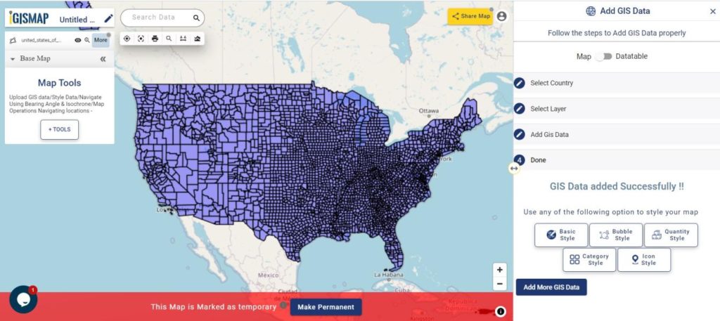
GIS Data by MAPOG makes it easy for users to access location-based vacation rental data from different regions across the world. With support for 15+ formats including KML, SHP, CSV, GeoJSON, SQL, DXF, MIF, TOPOJSON, and GPX, the platform ensures flexibility for both professional and academic GIS applications.
Download Vacation Rentals Data of any countries
Note:
- All data is provided in GCS datum EPSG:4326 WGS84 CRS (Coordinate Reference System).
- Users must log in to access and download their preferred datasets.
Step-by-Step Guide to Download Vacation Rentals Data
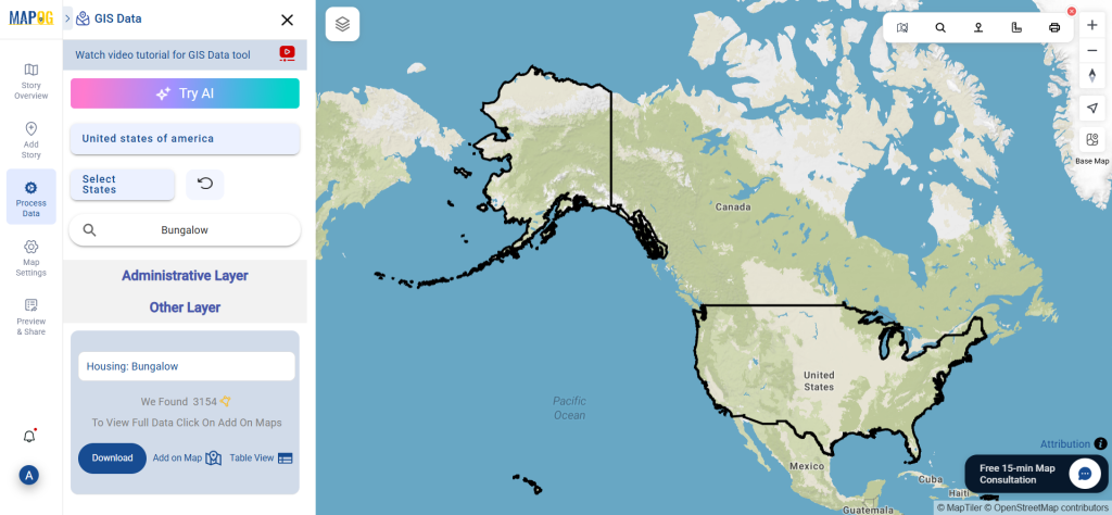
Step 1: Search for Vacation Rentals Data
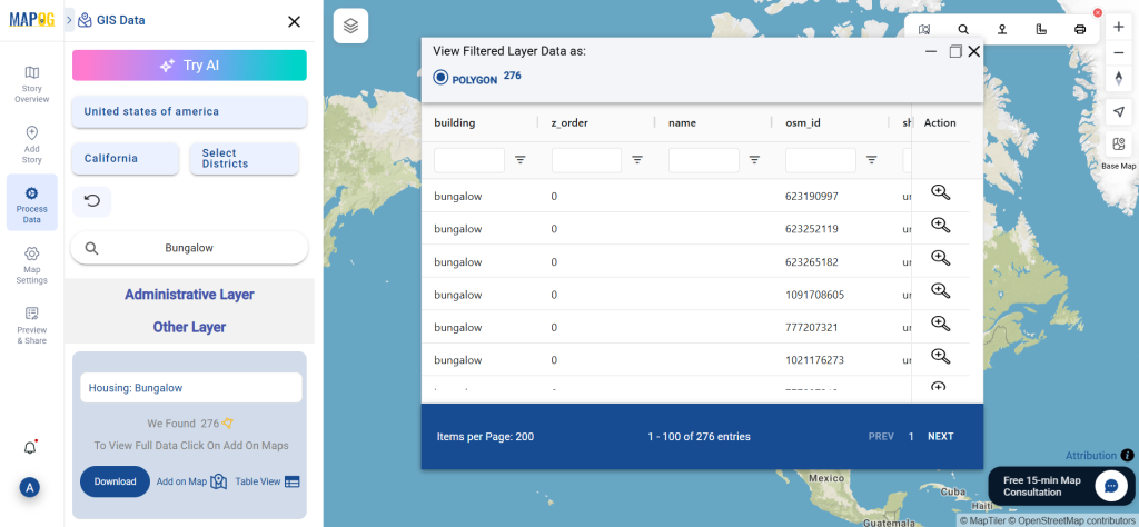
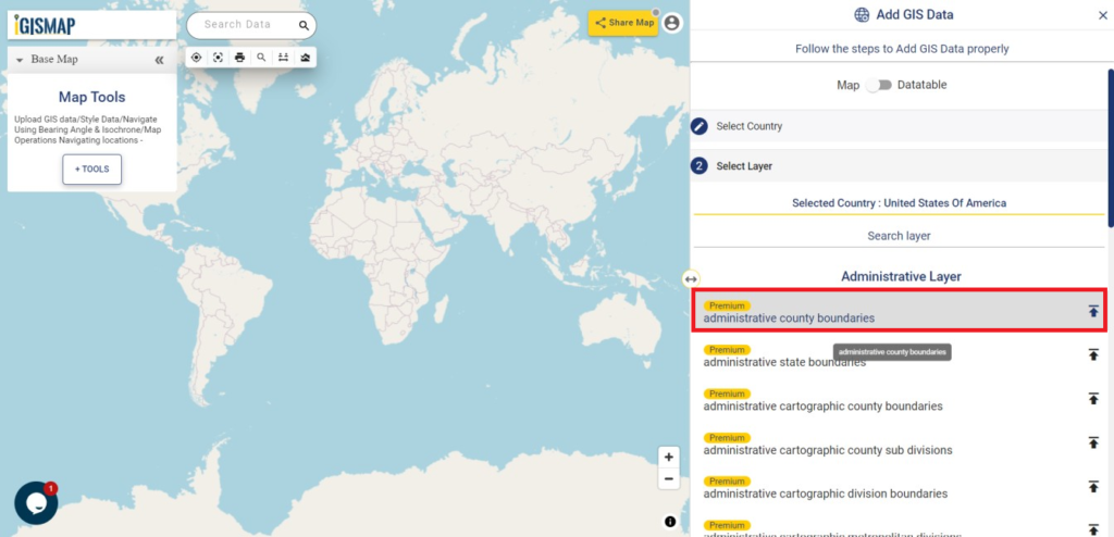
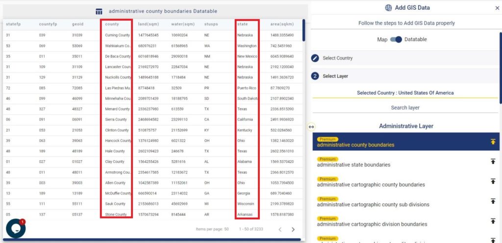
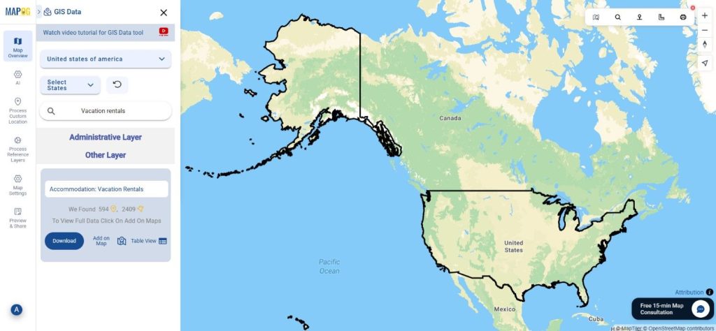
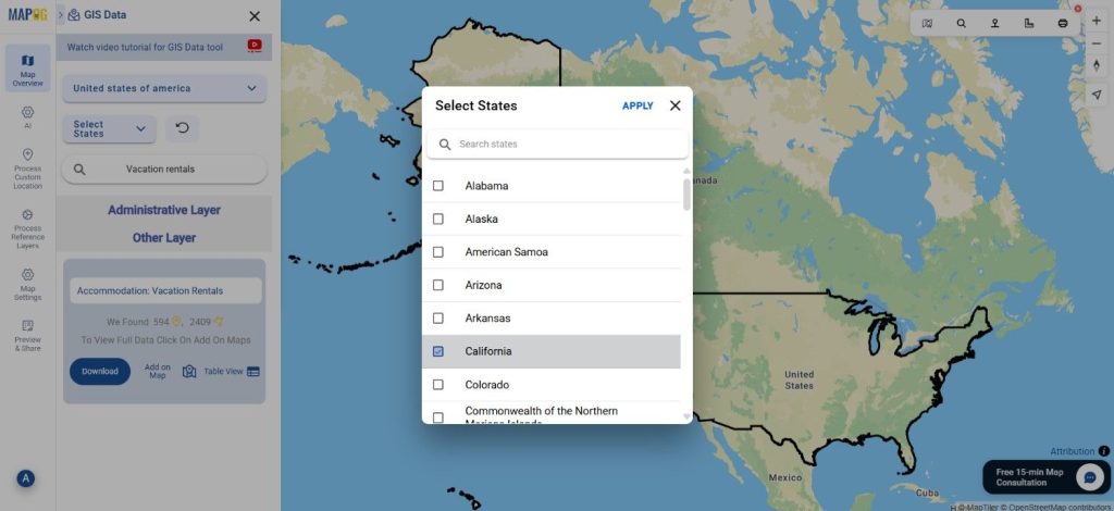
Begin by opening GIS Data by MAPOG and entering “Vacation Rentals Data” in the search layer bar. Select the dataset that matches your interest, whether it’s in point or polygon format, and review its metadata for details like coverage, attributes, and category.
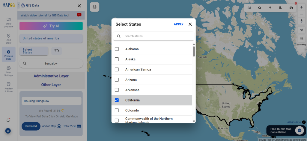
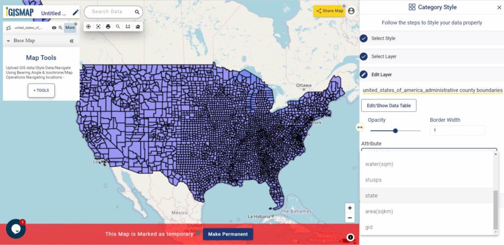
Step 3: Apply Data Filters
Narrow your results using the Filter Data option. You can refine the data by selecting specific states or districts, allowing you to focus on particular regions with high vacation rental density. For broader datasets, this feature helps you dig deeper and extract only what’s most relevant.
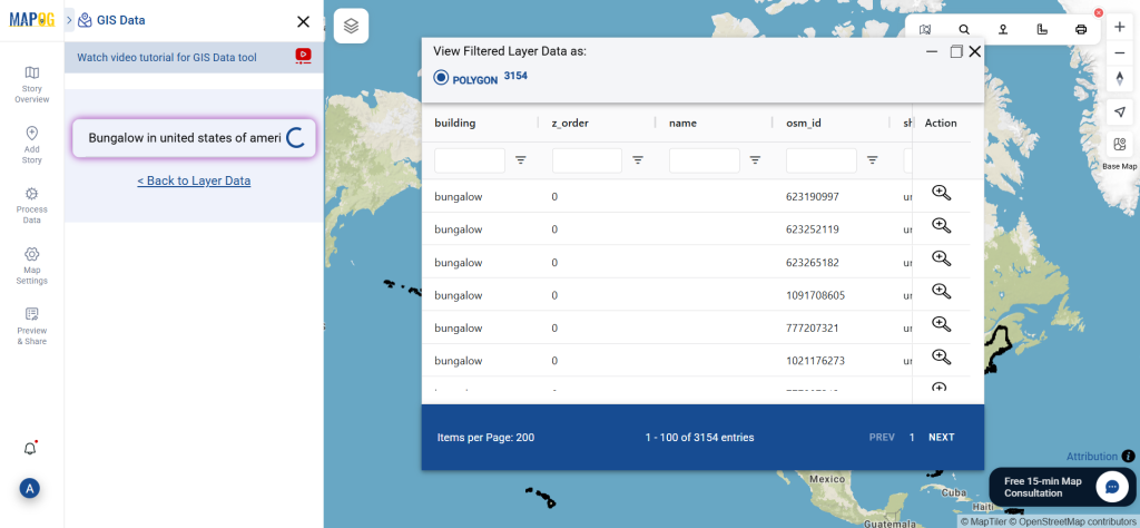
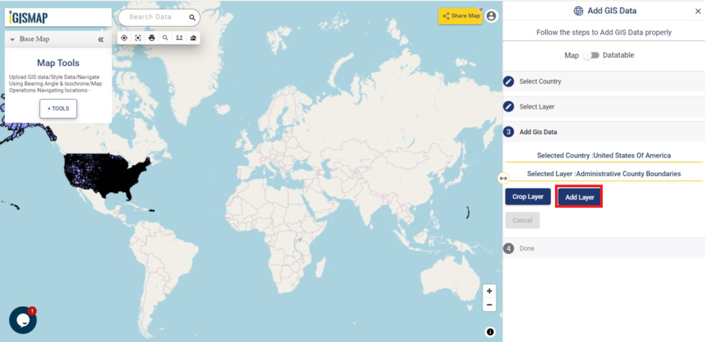
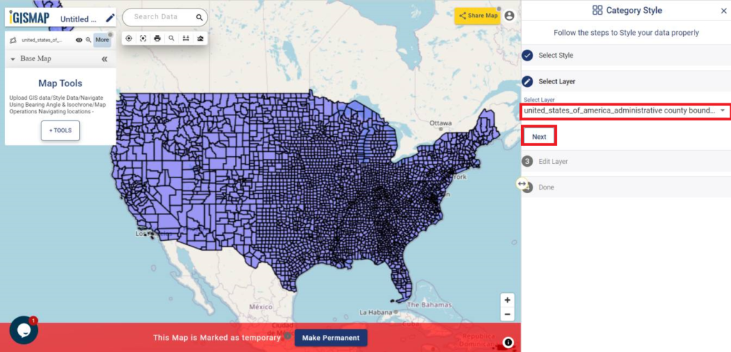
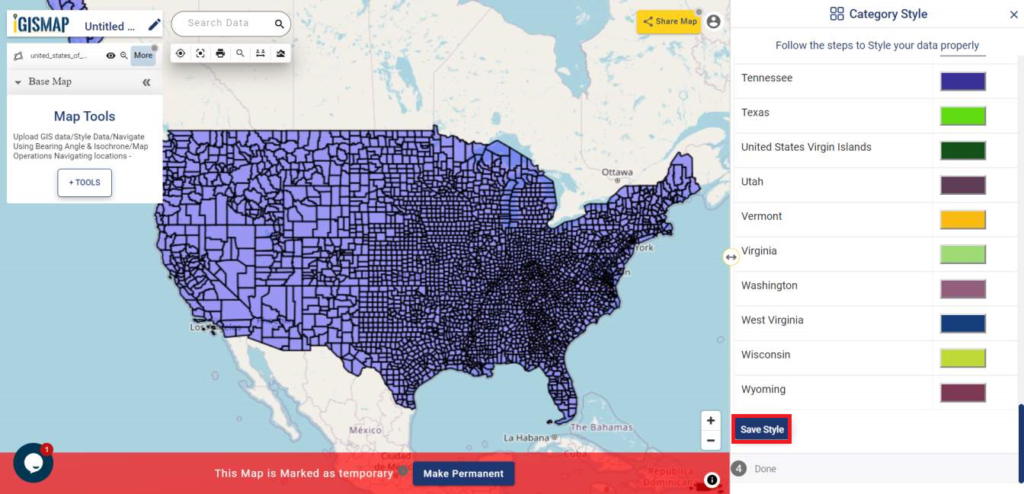
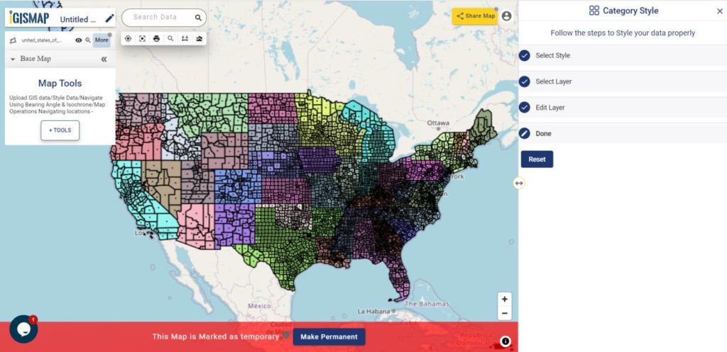
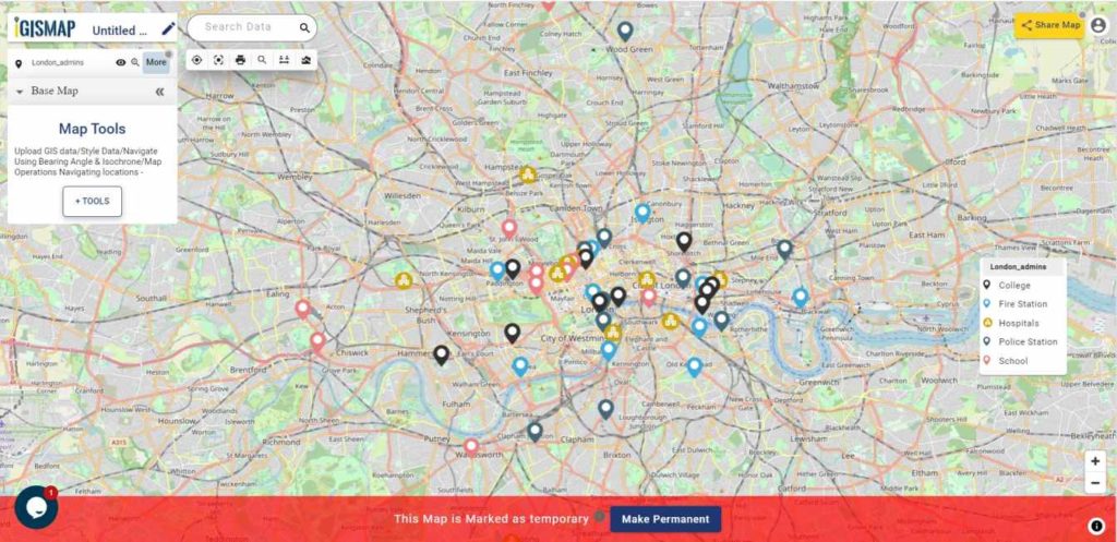
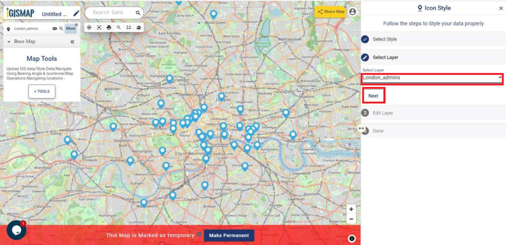
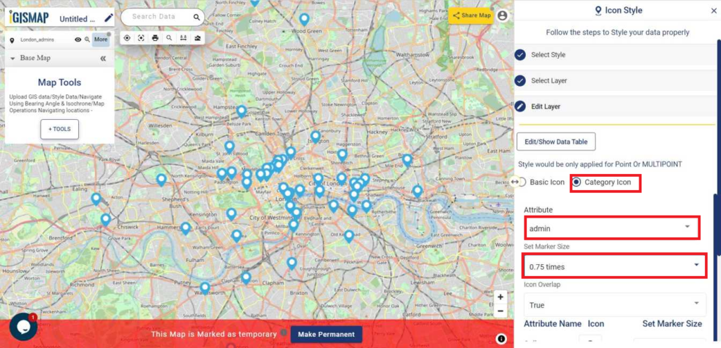
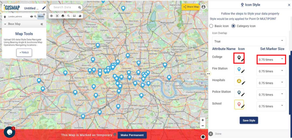
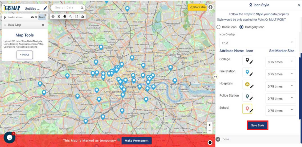
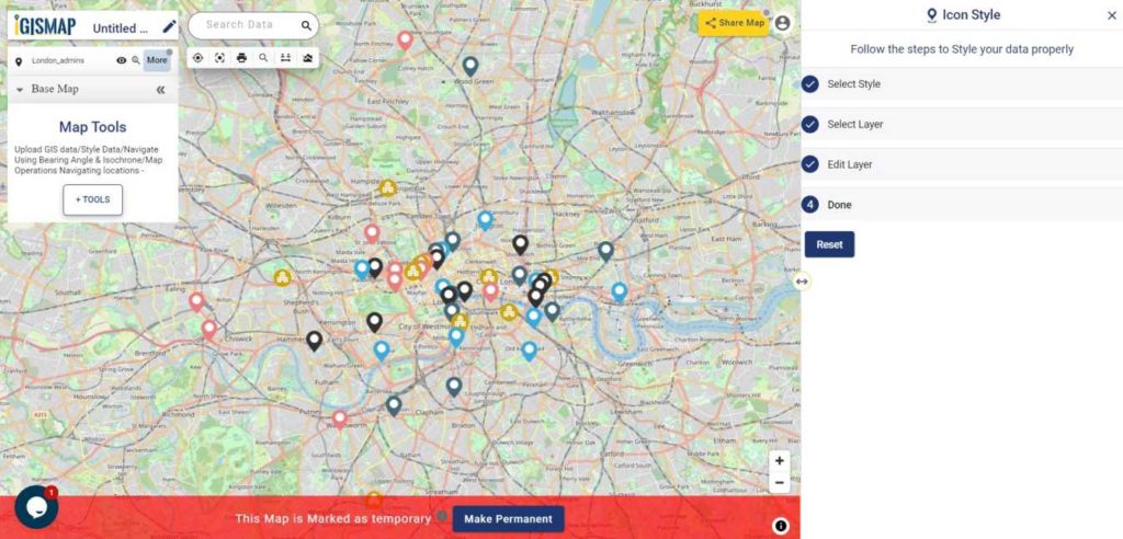
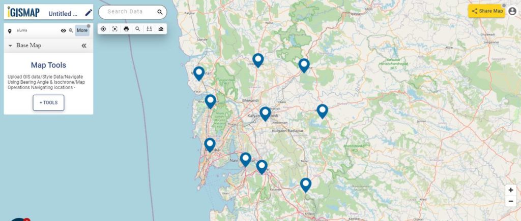
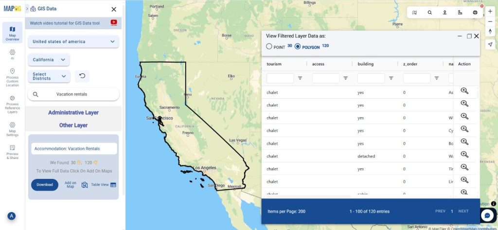
Step 4: Visualize with “Add on Map”
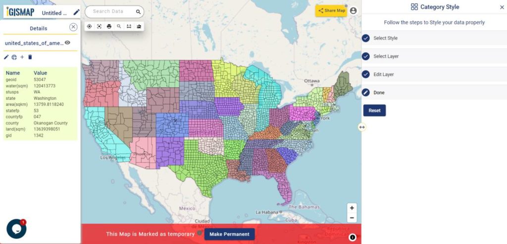
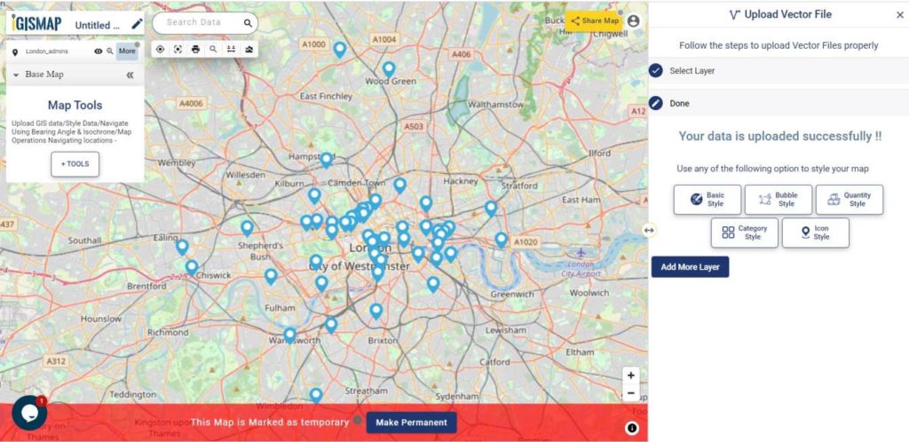
Once you’ve identified the right dataset, click “Add on Map” to overlay it on MAPOG’s interactive analysis interface. This step lets you visualize vacation rental clusters, explore local accessibility, and assess spatial distribution patterns for better tourism analysis.
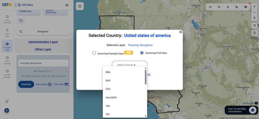
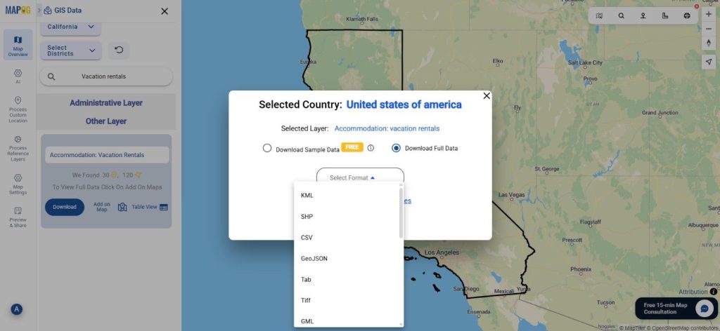
Step 5: Download Vacation Rentals Data
After reviewing your selections, click “Download Data.” Choose between sample or full datasets and select your preferred format—Shapefile, KML, GeoJSON, MID, or any of the 15+ available GIS formats. Confirm your terms and proceed with the download for immediate use in tools like QGIS, ArcGIS, or Google Earth.
Final Thoughts
With GIS Data by MAPOG, obtaining and visualizing Vacation Rentals Data is both efficient and insightful. The platform empowers users to analyze travel hotspots, evaluate property density, and plan tourism strategies with ease. Whether you’re a researcher, urban planner, or GIS enthusiast, MAPOG’s data flexibility ensures you always have accurate, ready-to-use information at your fingertips.
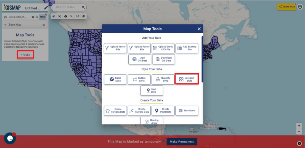
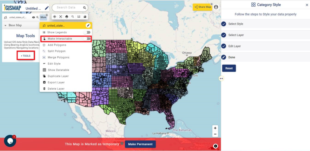
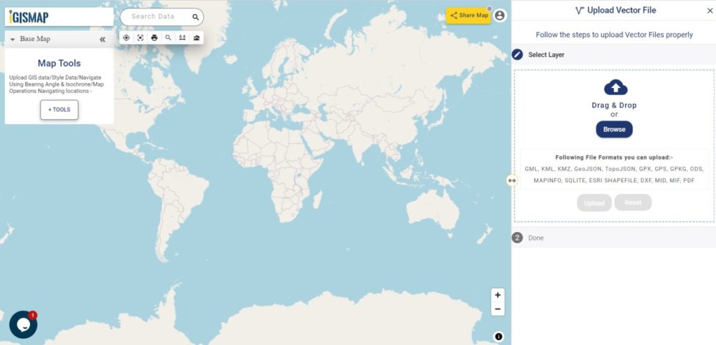
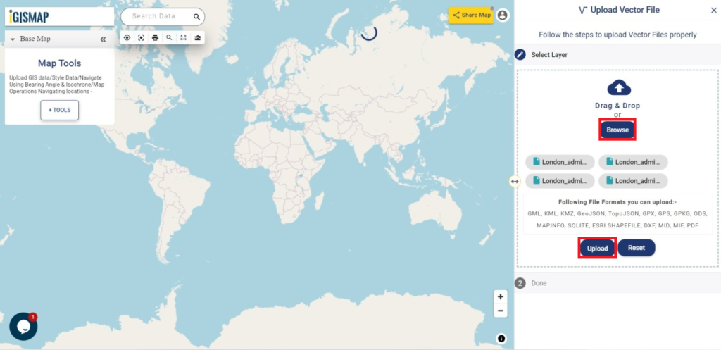
With MAPOG’s versatile toolkit, you can effortlessly upload vector and upload Excel or CSV data, incorporate existing layers, perform Split polygon by line, use the converter for various formats, calculate isochrones, and utilize the Export Tool.
For any questions or further assistance, feel free to reach out to us at support@mapog.com. We’re here to help you make the most of your GIS data.
Download Shapefile for the following:
- World Countries Shapefile
- Australia
- Argentina
- Austria
- Belgium
- Brazil
- Canada
- Denmark
- Fiji
- Finland
- Germany
- Greece
- India
- Indonesia
- Ireland
- Italy
- Japan
- Kenya
- Lebanon
- Madagascar
- Malaysia
- Mexico
- Mongolia
- Netherlands
- New Zealand
- Nigeria
- Papua New Guinea
- Philippines
- Poland
- Russia
- Singapore
- South Africa
- South Korea
- Spain
- Switzerland
- Tunisia
- United Kingdom Shapefile
- United States of America
- Vietnam
- Croatia
- Chile
- Norway
- Maldives
- Bhutan
- Colombia
- Libya
- Comoros
- Hungary
- Laos
- Estonia
- Iraq
- Portugal
- Azerbaijan
- Macedonia
- Romania
- Peru
- Marshall Islands
- Slovenia
- Nauru
- Guatemala
- El Salvador
- Afghanistan
- Cyprus
- Syria
- Slovakia
- Luxembourg
- Jordan
- Armenia
- Haiti And Dominican Republic
- Malta
- Djibouti
- East Timor
- Micronesia
- Morocco
- Liberia
- Kosovo
- Isle Of Man
- Paraguay
- Tokelau
- Palau
- Ile De Clipperton
- Mauritius
- Equatorial Guinea
- Tonga
- Myanmar
- Thailand
- New Caledonia
- Niger
- Nicaragua
- Pakistan
- Nepal
- Seychelles
- Democratic Republic of the Congo
- China
- Kenya
- Kyrgyzstan
- Bosnia Herzegovina
- Burkina Faso
- Canary Island
- Togo
- Israel And Palestine
- Algeria
- Suriname
- Angola
- Cape Verde
- Liechtenstein
- Taiwan
- Turkmenistan
- Tuvalu
- Ivory Coast
- Moldova
- Somalia
- Belize
- Swaziland
- Solomon Islands
- North Korea
- Sao Tome And Principe
- Guyana
- Serbia
- Senegal And Gambia
- Faroe Islands
- Guernsey Jersey
- Monaco
- Tajikistan
- Pitcairn
Disclaimer : The GIS data provided for download in this article was initially sourced from OpenStreetMap (OSM) and further modified to enhance its usability. Please note that the original data is licensed under the Open Database License (ODbL) by the OpenStreetMap contributors. While modifications have been made to improve the data, any use, redistribution, or modification of this data must comply with the ODbL license terms. For more information on the ODbL, please visit OpenStreetMap’s License Page.
Here are some blogs you might be interested in:
- Download Airport data in Shapefile, KML , MIf +15 GIS format – Filter and download
- Download Bank Data in Shapefile, KML, GeoJSON, and More – Filter and Download
- Download Railway data in Shapefile, KML, GeojSON +15 GIS format
- Download Farmland Data in Shapefile, KML, GeoJSON, and More – Filter and Download
- Download Pharmacy Data in Shapefile, KML, GeoJSON, and More – Filter and Download
- Download ATM Data in Shapefile, KML, MID +15 GIS Formats Using GIS Data by MAPOG
- Download Road Data in Shapefile, KML, GeoJSON, and 15+ GIS Form